Live photo converted to gif.
Tag: animatedgif
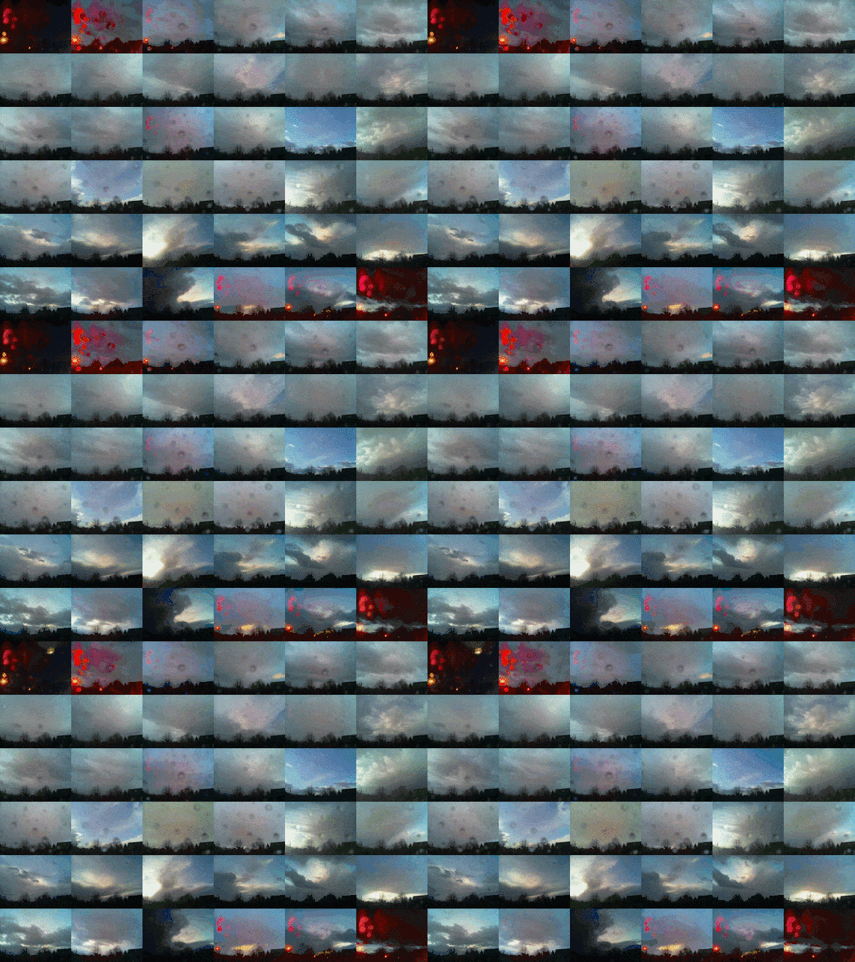
Playing with gifsicle & imagemagick to combine gifs from Sky Pi.
GlowGifGuides with LICEcap
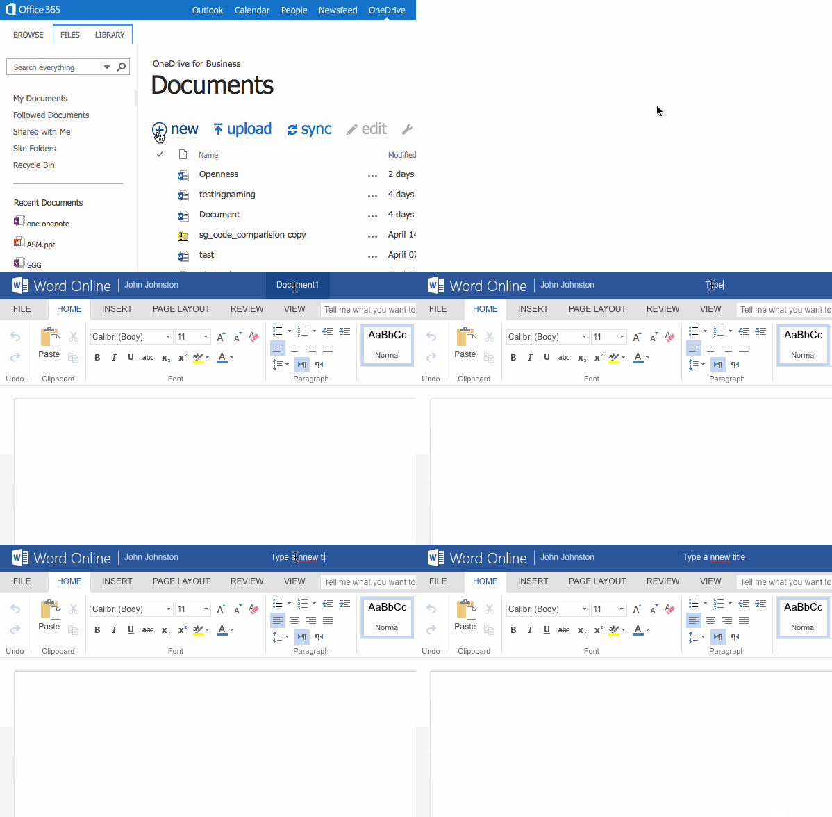
Here is a nice quick way to create short screencasts as animated gifs.
The one above was created because there seems to have been a change in the way you create documents in onedrive for business (ie in the MS 356 tenancy in glow).
Previously I got a dialog to name a file when I clicked +new in onedrive. Now it just created a new doc and takes you there to edit it. After saving you can rename the doc from the file list by clicking the elipse … after the doc name, but that is a bit of a fuss. It is easier to rename the doc when editing by clicking on its title.
LICEcap can capture an area of your desktop and save it directly to .GIF (for viewing in web browsers, etc) or .LCF (see below).
LICEcap is an intuitive but flexible application (for Windows and now OSX), that is designed to be
lightweight and function with high performance.
from: Cockos Incorporated | LICEcap
LICEcast is free and runs on windows and mac.
Screen-casting usually takes a fair bit of effort, sometimes using quite a complex application and needing some editing. This resulting vide may not play on different browsers or operating systems. Animated Gifs are pretty compatible. It only took me a few moments to create the one above and upload it.
Here’s iterating at you, Chad
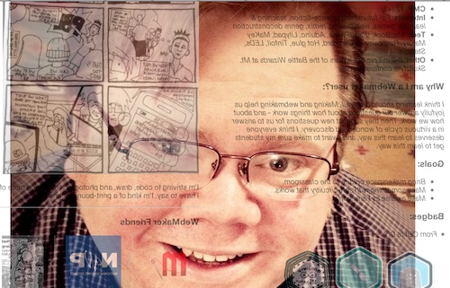
Week two of the teachtheweb mooc starts with a challange: Explore the awesome makes from last week, choose one, and remix it.. At lunch today I though I’d take a very quick stab at this using Chad’s Webmaker Profile, as Chad is a fellow ds106er and I though he would enjoy the play.
The First shot
Given I was on my lunch break, I though I’d just flip the profile: Chad’s Webmaker Profile. I went to Chad’s original profile and added edit after the url, this opened thimble for me to edit his profile. I know that you can flip, turn and rotate elements of a webpage via the css transform. A quick google and I came up with:
transform: rotateY(0.5turn);-webkit-transform:rotateY(180deg);
This rotates content 180 degrees around the y axis. I added it to the css section in thimble, changing this:
body { font-family:Open Sans, "Helvetica Neue", Helvetica, sans-serif;width:1000px;margin:0 auto; }
to this:
body { font-family:Open Sans, "Helvetica Neue", Helvetica, sans-serif;width:1000px;margin:0 auto; transform: rotateY(0.5turn);-webkit-transform:rotateY(180deg);}
I think you need to use both transform: rotateY(0.5turn) and -webkit-transform:rotateY(180deg) to get cross browser support, but I might be wrong.
Quite please with 3 minutes work I posted to the G+ Community.
Looking out
Between a comment and an image I made for ds106 a while back, I started thinking about the page being a view out of the computer, so it should be looking at Chad:Chad’s Webmaker Profile.
On this edit, I’ve added Chad’s photo, hotlinked from his g+ images as a background image. All this took was adding a wee bit nmore css to the body:
background-image:url('fullimageURL.jpg');
	background-repeat:no-repeat;
	background-attachment:fixed;
	background-position:center;
In the bloc above I’ve shortened the url, I used the full url to the image. The code first adds the iamge as a background to the page, ensures it does not repeat, fixes the position to the window and lastly centres it.
Itterating
What is probably irritating for my fellow MOOCers is that I am posting these and as I post geting more ideas, this means a lot of space is taken up on the G+ group.
As I post the last one, I irritate myself as the background picture does not fill the screen. Google again and I get this:
	webkit-background-size: cover;
	-moz-background-size: cover;
	-o-background-size: cover;
	background-size: cover;
All 4 lines do the same thing for different browsers.
I also notice a new post with an audio mashup, this reminds me of Freesound where I find: Freesound.org – “computer-noise_desktop_quadcore_2009.wav” by matucha, I know Freesound supply low quality mp3 and ogg files so add an audio tag to my page, just after the body tag:
<audio autoplay>
	  <source src="http://www.freesound.org/data/previews/160/160465_739478-lq.ogg" type="audio/ogg">
	  <source src="http://www.freesound.org/data/previews/160/160465_739478-lq.mp3" type="audio/mpeg">
	  Your browser does not support the audio tag.
	</audio>
As I don’t have any controls in the tag, the player does not show, but autoplay gets it going when the page loads.
Finally I remember that Chad suggested a gif, so I download his image and make a gif of him rolling his eyes. Upload that to google and hotlink instead of the original jpg as a background. finally I have: Here’s iterating at you, Chad, I had to save twice as I needed to attribute the audio which is share under a Creative Commons — Attribution 3.0 Unported — CC BY 3.0 license.
So here is the Final version:
Here’s iterating at you, Chad.
Musing about Making
So like a lot of the things that I do for fun, this sort of bumbled along with one shot leading to the next. What was great about doing this inside the #teachtheweb community was there were lots of ideas to bounce off. This blog post was started after a comment on the final link I posted. Does that make this connected learning?
One of the lovely things about html is, if you know sometinhg is possible the method is just a quick google away. I wonder if that makes web editing a more accessable way of encouraging creativity?
Thimble thoughts
I’ve made between 6 and 10 experiments with Mozilla Thimble now, which makes me an expert![]()
I’ve found it a wee bit slow on older computers, so I’d think about that before using it in a class.
The split screen view is really good for seeing the changes made to the code take effect. I would however like the option of a tabbed screen so that I could see the whole of the preview without needing a huge screen. I’d also like the forthcoming ability to re-edit a page rather than having to save with a new url. The trail of urls is good for reviewing the process and blogging about it.
I would also like thimble to keep a track of my creations, I am pretty sure I’ve lost track of a few.
The most powerful features of thimble are, for me the templates which have great comments and the way you can easily edit someone else’s creation.
An Introduction to Blade Runner
I’ve been MIA from etmooc for the past week or so, busy time at work, edutalk and life in general have conspired. I’ve been glancing at g+ and reading a fraction of the posts but that is about it.
Daunted from doing much thinking I decided to fall back on animating gifs, one of the tasks in topic 2. I am happy messing about with gifs so this is a restful activity.
Falling back on an old favourite I downloaded a clip from youtube of the opening sequence of Blade Runner.
I quickly grabbed a few very short sections of 9 frames each. Once I looked at them I though they would combine nicely.
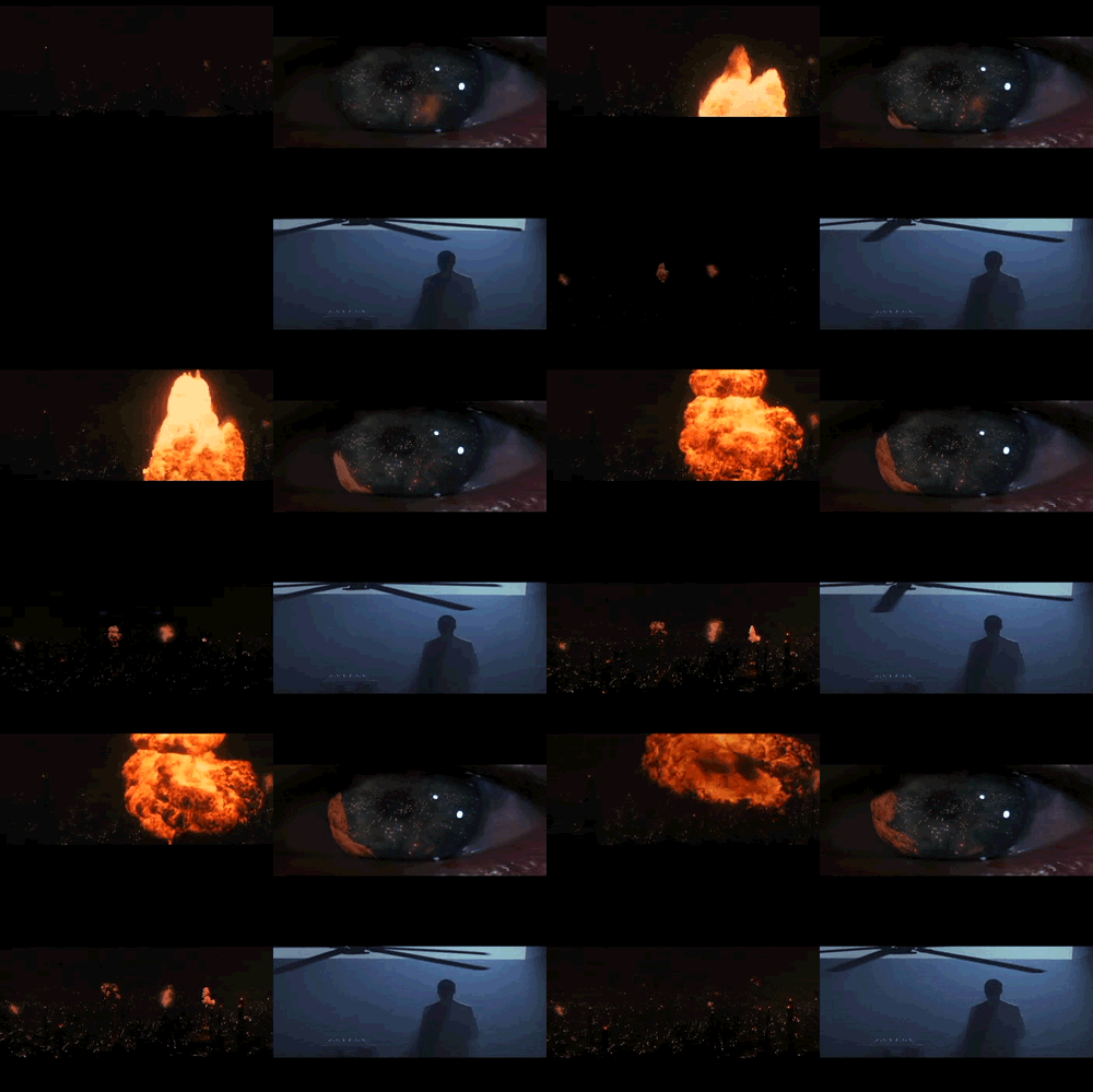
I did this in FireWorks CS3. Fireworks allows you to import gifs quickly and place them on a image. You need to place them in the right place first click so I put on place holder graphics with the same dimensions of my gifs to make it easy to line them up.
This turned out quite well. Caught some of the mood of the opening scene perhaps. I would have been better making a better quality version of the fan gif to avoid the banding. The eye could have done without the extra fireball on the last clip but I like the way it almost mirrors the ‘real’ fireball on the left.
Just Drafting

I’ve been continuing to enjoy dipping into the #ETMOOC stream, beginning to feel a lot more relaxed about missing things.
A couple of days ago I followed a link by Tiago Santos to Basic Ingredients for Good Web Writing | Chapter Three. This is pretty straightforward stuff and as Tiago says good advice. I commented Advice that takes its own advice. I am cringing a bit thinking of my messy, discursive and rambling blog posts.
So I was much encouraged to listen to T1S2 – Sharing As Accountability w/ Dean Shareski one of the things Dean touched on was thinking of posting on a blog as drafting. Here is one of my favourite snippets:
A few quotes:
The mindset around the notion of publishing needs changed.
Comparing blogging to posting photos:
the expectation that some one could, if you gave them permission, download it and improve it.
and
Not publishing just sharing
Dean also touched on the idea that folk should filter what they write, agreeing with Stephen Downes in that it is the audience’s job to decide what to read. This chimes with a non edu post I read this morning The Unfollower – Matt Gemmell.
My own blogging is certainly rambling, both in posts and subjects. I would guess that many of my posts, typically the ones on AppleScript or JavaScript have an even smaller audience than most of my posts. I am going to follow Dean’s advice and keep posting them.
I am also going to try to improve my writing (after 8 years it is about time) by cutting down the rambling inside a post. So I am not going to go on in this post about some slightly connected google plus thoughts or how I bookmark audio.
Credits
I used etmooclogo by Adam Lark (remix from Alec Couros) and Dean Shareski talking with students at EdWeekSJSD by nashworld both under a Creative Commons — Attribution-NonCommercial-ShareAlike 2.0 Generic — CC BY-NC-SA 2.0 which allows remix.
More #DS106: Camp Magic MacGuffin

At the start of this year I became involved with DS106 an open online course on Digital Storytelling. I posted 20 or 30 articles here categorised as DS106
This summer I have signed up again for the DS106 summer Camp Magic MacGuffin but will be posting at a new blog I’ve set up here: 106 drop in. This is a wordpress blog, which plays better with the DS106 aggregation scheme and will allow me to play a bit with WordPress.
There will be a minecraft element to the course this time, I’ve paid for the software but have only manages very short times on the server before being killed. A whole new world in may ways.
I recommend DS106 if you are interest in playing with digital media, it is easy to join in and you can do as little or as much as you like.
The history of the animated GIF #ds106
I am sure most of the #ds106 folk will have seen this, but this is a great wee movie with lots of interesting uses of animated gifs. I’ve been a long time disparager of those animated gif clip art things on the web but recently converted to a fan by Jim Groom and ds106.
Stereogranimator

Create and share animated GIFs and 3D anaglyphs using more than 40,000 stereographs from The New York Public Library.
Since I’ve spent a fair bit of time animating gifs for DS106 of late this was interesting.
Stereoscopic photography recreates the illusion of depth by utilizing the binocularity of human vision. Because our two eyes are set apart, each eye sees the world from a slightly different angle. Our brains combine these two different eye-images into one, a phenomenon that enables us to “see,” ever so slightly, around the sides of objects, providing spatial depth and dimension. Stereoscopic views, or stereographs, consist of two nearly twin photographs — one for the left eye, one for the right. Viewing the side-by-side images though a special lens arrangement called a stereoscope helps our brains combine the two flat images and “see” the illusion of objects in spatial depth.
and
The Stereogranimator joins these latter-day adventures of the venerable GIF, mashing up an important early genre of internet folk art with a nearly forgotten species of folk photography.
You get to play with the creation of the gif, this creates a 2 frame animated gif and alternates between them.
Bonus link:Create 3D anaglyph images with 3 lines of Ruby code « saush
Update Colin maxwell tweeted Start 3D photos: 3D photo sharing and printing made easy

