Yesterday I tweeted a link to a great post, the transcript of a talk about some social aspects of technology and how allowing technologist to lead our progress might have negative impacts on our privacy and lives, here is a quote.

Those who benefit from the death of privacy attempt to frame our subjugation in terms of freedom, just like early factory owners talked about the sanctity of contract law. They insisted that a worker should have the right to agree to anything, from sixteen-hour days to unsafe working conditions, as if factory owners and workers were on an equal footing.

Companies that perform surveillance are attempting the same mental trick. They assert that we freely share our data in return for valuable services. But opting out of surveillance capitalism is like opting out of electricity, or cooked foods—you are free to do it in theory. In practice, it will upend your life.

Remarks at the SASE Panel On The Moral Economy of Tech

This spoke very much to some thoughts I’ve been having about our relationship to technology companies. Some of these were sparked  by Dean Groom, Why not to buy Minecraft Education Edition.  Some more idaea were discussed at the Always on (them) event at the University of the West of Scotland and I am in the midst of exploring those in a few microcasts, tagged DigitalUWS & microcast (one down a few more to go).

I’ve not come to any great conclusions but I do think it is something we should be thinking a lot harder about.

More grist arrived today from Stephen Downes:

I can see how the presentation would engage school leaders looking for a way to address current trends in learning, but they need to look beyond the single-vendor approach proposed here, and they should be clear that technology companies are service providers who are held accountable for delivery, not partners taking a hand in pedagogical and educational decisions.

Looking back to move forward: A process for whole-school transformation ~ Stephen Downes

I know myself enough to recognise that I am somewhat enthralled by technology and software. I certainly need to think about my relationship, on so many levels, with the technology I use. Should we be addressing this in the classroom with our pupils?

featured image is probably walking a copyright tightrope, but seems appropriate

Linked from several mac blogs and news sites is the HyperCard episode of Simple Beep (Simple Beep is a podcast looking back at the history of Apple and the Mac community).

HyperCard is a pice of software that certainly changed my life, turning me from someone who had no interest in computers at all to someone who spent 10 years typing HyperTalk. I’ve blogged about it occasionally. The podcast is great. And there are great set of links in the shownotes including:

This reminds me that you can Run a Hypercard stack on a modern Mac (A quick test and I am excited again) and that I have a Color Classic that I should boot up sometime.

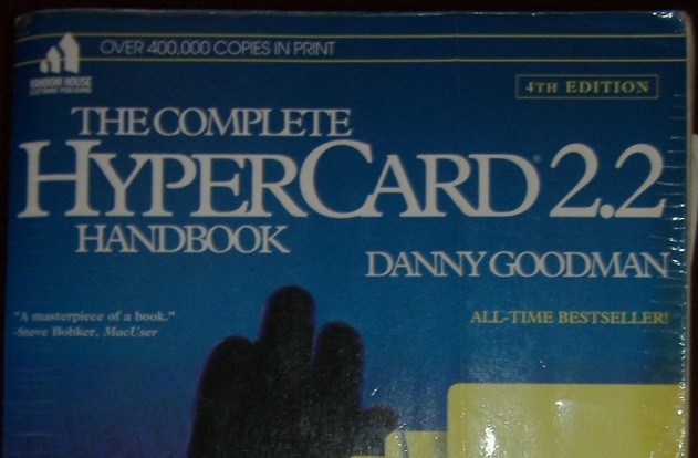
The featured Image of this post is one of my, many times read, HyperCard Handbook.

I had a bit of a play with Adobe Slate this morning. It is an iOS app for publishing words and pictures.

The Devil's Pulpit
The Devil’s Pulpit

It is quite a very process which allows you to get good looking results quickly. Macworld points out some limitations that struck me immediately.

It’s dead-simple, but also quite limited. You can choose from a handful of themes to change the whole look of the story, but can’t adjust individual fonts or formats, or even add a link within a larger block of text. (You can, however, place links as standalone buttons.) You can change image formats so they appear full screen, inline, or as a scrolling “window,” but you can’t add borders or freely move images around. Video isn’t supported at all.

What we gain

I guess slate is part of the same move to allowing producers to concentrate on the content while the ‘professionals’ provide the design.
Like Medium you cannot argue with the results from a clean readable point of view.
We can publish text and pictures easily on a blog. I am sure we can find a theme or two with typography that is as good, but I suspect it might be hard to find such elegant handling of images.

What we lose

I am not a professional writer or photographer, neither am I a designer or coder (obviously;-)).
I publish ‘stuff’, sometime approaching stories, because it is fun and I want to explore the potential of these activities for learning. I have different degrees of interest in all aspects of the process, I think I can learn from each.
I’ve been thinking about the tension between ease of use and creativity for a while. For learners we will sometimes want them to concentrate on one particular aspect of the work. I can’t be the only teacher who sometimes asked pupils to leave font and style changes till the story was finished. At other times we will want them to get fully involved in messy learning.
We also lose some control of the data when we publish to silo sites. I am pretty sure that Medium and Adobe will be around a lot longer than Posterous, but I still like backups.

Alternatives

Just as I am writing this I remember an earlier experiment A Walk to Loch Oss using Odyssey.js

The odyssey.js library is being developed to help journalists, bloggers, and other people on the web publish stories that combine narratives with maps and map interactions. The library is open source and freely available to use in your projects. It is initially being built to work with most modern browsers

from: odyssey.js README on GitHub. Odyssey.js adds maps to the mix but might be an interesting alternative to Slate that allows you more control and ownership. I am sure there are others out there.

update

After I posted this I kept thinking about the ‘own your own’ argument and decided to have a wee go at replicating the story myself.
A bit of googling for CSS hints and a couple of JavaScript libraries and I have The Devil’s Pulpit 2, handcrafted.

It is nowhere near as slick as the Adobe version(surprise) and so far does not look good on mobile.

It was a lot of fun to play with but I noticed a lack of attention to the actual story in my process.

I guess the best thing about tools like slate is the way they get out of your way and let you focus on content. I just like some of the fussing and futzing that goes with more basic solutions sometimes.

it is seldom about technology designers’ a priori plans for a technology, and more about users’ unexpected practices with it. That, to me, is the most fascinating and useful basis of research inquiry.

via Brief statement on ‘Digital Wisdom’ | Ibrars space.

I love ‘unexpected practices’ it is why we need flexible technology in Learning and Teaching.

My favourite use for word when I was teaching primary 6 was as a poor man’s vector editor, Sandaig Otters » Seeing Stars, and I’ve often been surprised by how pupils and teachers bend unsuitable software to their needs.

Clarify icon

I’ve spent a fair bit of time when working at North Lanarkshire and back in school in creating howto instructions for software or computer tasks. Generally this involves organizing a bunch of screenshots and text on a page. I usually use Pages (or sometime comiclife) occasionally Word. I’ve though of myself as quite competent in grabbing screenshots (cmd-shift-4 on a mac, spacebar toggles rect/window capture), switching to pages (cmd-tab repeat tab until pages is selected and let go), and pasting the image in (cmd-v) before command tabbing back to where ever the screenshots are coming from.

Recently I’ve been making a few help sheets for glow blogs and on a whim remembered Clarify. I’d tested it but not been impressed for reasons I can’t recall. I got the application through a macheist software bundle a while back. Given I’ve quite a lot of screen-shooting to do I though I’d give it another go. I was quite please to find that I qualified for a free update to Clarify 2 My first impressions of the application have been overturned.

Workflow

Clarify 2 is great for making documents that consist of a series of screenshots and text. The great advantage the application has from a more manual approach is workflow.

  1. You launch the application
  2. Switch to the application you want to explain
  3. Work through the process taking screenshots (cmd-shift-2) as you go.
  4. The screenshots are placed in a clarify document. Clarify stays in the background.
  5. After taking all of the screenshots you can switch to clarify.
  6. Work through the sections, adding titles, descriptions and annotating the images with the built in tools.
  7. Export to word, pdf, html.

You can copy and paste as rtf or publish to WordPress, dropbox or clarify-it.com (the latter is a free beta at the moment).

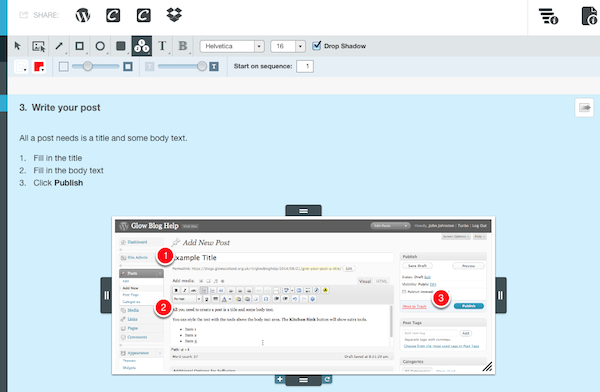
As you work through the clarify document you can resize the screenshots, annotate them and combine them. The defaults are sensible and the annotation tools are both simple and powerful.

Clarify Interface

The exports can be further enhanced with templates, but I’ve not tried that yet. The publishing to wordpress has worked well in a couple of tests.

To round up, clarify seems to save time buy improving the workflow, decreasing the amount of tinkering and adjusting to be done and exporting to several useful formats. The application costs £18.70 for mac or windows and there is a Mac/Windows Cross-Platform License at £24.94. Well worth the money in my opinion.

I’ve seen quite a few references to Pivot Stickfigure Animator for making simple animations in the classroom,for example these ones from Kent ICT, but never tried it out. Pivot is windows only software and until the Dell refresh in Glasgow primaries I could not install software there. Now I’ve moved to North Lanarkshire where most of the primaries run macs so I’ve not tried it here either.

Last week I was checking some old Supercard links and found reference to Stykz – The first multi-platform stick figure animation program on Sons of Thunder Software developer site. It looks like Stykz has been developed with revolution which is sort of a modern x-platform HyperCard clone. Ken Ray of Sons of Thunder used to be a very helpful contributor to the Supercard mailing list.

Stykz worked well on my mac at home proving to be simple and engaging to use. I can imagine that some children would find it very appealing. Stykz exports to animated gifs and quicktime movie files, in my brief test the movies were a wee bit smaller that the gifs, swf support may be coming, I presume that would make for smaller file sizes.

Stykz is still in Beta, version 1.0 for Mac and windows is expected on the 30th of April the Linux version will follow a month later. The Stykz F.A.Q. lists some interesting features in the works.

The example below show a lack of imagination on my part, but only took a few minutes to produce 70 odd frames and export to a mov file. Well worth a download if you are thinking of teaching the basics of animation and giving your class some fun.

T“>