Mobiles and mobile apps are becoming more powerful every day. Back in August last year I downloaded and installed Universe. Clearly marked as a beta it allowed you to make verses, these were a grid of media that could be mixed: photos, video, text, maps and sounds. There was different types of interactivity and you could even put html and javascript in a verse.

I played around with this occasionally, mashing up the contents of my camera roll. The app crashed occasionally and the creations were only really visible inside the app. Still it was fun, and interesting to see what others made with it.

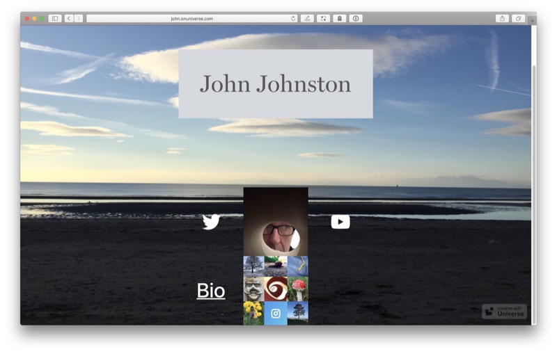
Yesterday I got a email, the betas was over and new version was out and it had changed tack. Universe was now a tool to build websites. I downloaded it and made a page within about 3 minutes: ‎john.onuniverse.com.

Hosting on an onuniverse.com subdomain is free, but you can pay for a domain.

When I tried the original betas version it felt as if the lack of publishing to the web was the main problem. This is now fixed. The new version lacks many of the interactive features of the beta, but it share the same easy to use interface. On creating or editing a page you have a 3 by 5 grid. Clicking on a square on the grid or dragging over several (so you can have a larger block) allows you to edit that square. You choose the type of content and then edit. Once you are finished a click or two and the site is published.

Publishing to the web from your phone is nothing new, I blogs from my iPhone, have edited sites with text editors and there are lots of ways to publish. Universe stands out as one of the easiest ways to put up a neat page quickly while on the go.

Adding further pages to your site is at the moment not as elegant as it could be, they don’t share the same sub-domain. There is no support for animated gifs (converted to jpgs), videos can only be 3 seconds long and loop in a gif like manner. I’d love to see support from some of the ways that the ‘old’ universe animated sections of the grid and sound could be played. I guess that might come. But overall this is a really nice way to make a website very quickly.

If you want a quick individual about me page for an event or to knock up a page for your days photos on the bus home, this is the app for you. I wonder too if it could be used in education. From a data protection pov I am not sure where it would stand, but it could be fun for pupils to build wee sites.

Featured image: combine screenshots of the app.

Some links:

Over the years I’ve used dropbox as a quick way to publish webpages. many of which I’ve linked to from post here.

I’ve got plenty of other places to post to the web but for some things and some wee projects it has been very convenient to drop html files into my dropbox’s public folder they are published.

Dropbox Basic (free) users: Beginning October 3, 2016, you can no longer use shared links to render HTML content in a web browser. If you created a website that directly displays HTML content from your Dropbox, it will no longer render in the browser. The HTML content itself will still remain in your Dropbox and can be shared.

from: The public folder – Dropbox Help – Dropbox

Google Drive did something similar at the end of August this year.

I believe that both services removed this feature because of abuse. A great pity. It will have broken quite a few links I’ve posted.

The most frequent use I made of this was a simple mashup of gpx files, google maps and flickr photo sets. It was on adding to this today I notice the breakage.

I suppose I could try one of the services that publish your files in dropbox else where or set up some sort of script to upload things but any alternatives, ftp, surge, github etc that I’ve tried lack the simplicity.

Featured image Beat-Up Box 3 | Bill Bradford | Flickr CC-BY.

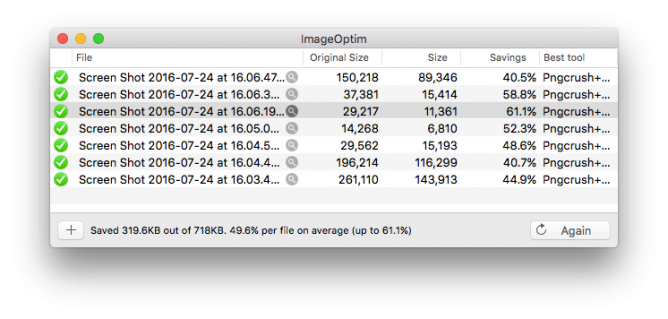
I know we are in the days of lots of free space, but it is worth remembering when blogging (or making webpages) shrinking images is worth doing for your visitors.

I don’t always do it, but today as I updates a Glow Blogs Help page, I saved nearly half the space by using, ImageOptim — better Save for Web.

There are other tools, but this one is free & open source, works on a Mac, but lists and links to windows & linux tools.

I’m not on holiday at the moment but taking the odd day off over the summer. Yesterday was one. I found a good set of amusing links, here are a few.

The New Devil’s Dictionary From The Verge updates Ambrose Bierce’s The Devil’s Dictionary.

Examples:

blogger (n.): An invasive species with no natural predators.

GIF (n.): Many prefer to pronounce this word “GIF,” instead of the more controversial-sounding “GIF.”

music (n.): An art form whose medium is copyright law.

And so on.

This reminded me to google for an english translation of Flaubert’s Dictionary of Received Ideas, hoping as usual for a creative commons version that could be played with. As usual I didn’t find that but got In Place of Thought – The New Yorker by Teju Cole which adapts the idea for modern times:

COFFEE. Declare that it is intolerable at Starbucks. Buy it at Starbucks. EVOLUTION. Only a theory. FASCISM. Always preceded by “creeping.” FEMINISTS. Wonderful, in theory. FISH. A vegetable.

Ouch, that last one stung!

Bonus Twitter mashup

Checking Teju Cole (@tejucole) on Twitter as his ideas started as tweets, I found:

  1. He seems to have abandoned twitter and
  2. The Time of the Game, a synchronized global view of the World Cup final. Just the sort of thing I like on the web, except for the football element.

Pano from Beinn Bhreac

Here are a great series of articles that I came across this morning. I’d recommend everyone interested in the Internet and education to read them.

For someone who reads a lot online I do not dip into TES often. So I was excited to find:
Jim Knight: ‘Let’s give all students their own domain name – and watch the digital learning that follows’ today.

Ironically I got it via Jim Groom’s post:
Domains and the Cost of Innovation. I do read Jim’s blog religiously.

Jim Knight’s article is based on another wonderful post by Audrey Watters> Audrey writes about the work of Jim Groom and others at the University of Mary Washington: The Web We Need to Give Students.

I’ve been muttering and mumbling about this idea for a good while now, based on reading about the UMW project and taking part in DS106. I really hope that the TES article gives the idea some legs and it can get some traction in the UK and more importantly, to me, in Scotland.

Before I started working on the Glow team, I included it in a post, Glow should be at the trailing edge?. I don’t think the idea has ever been given serious consideration at the right level. It certainly goes is a slightly different direction than Glow is going but it is still worth considering.

Replied to Futzopublicus is my Dackolupatoni (CogDogBlog)
This was in fact a fabulous part of my presentation, and opportunity to show the time honored DS106 tradition of messing up (aka “futzing”) in public- Futzopublicus. So do be a favor, see how we can change the distribution of sand grains, use “Futzopublicus” online now.

So do be a favor, see how we can change the distribution of sand grains, use “Futzopublicus” online now.

from: Futzopublicus is my Dackolupatoni

Nice lesson from Alan Levine, about the web and how it works, of  a URL being a living thing.

Just joining in to see how this ripples, but it would be an interesting lesson with a class:

  1. Who can find a word that is not searchable?
  2. How fast can we make it searchable?

Untitled


Update 10 minutes after posting:

Screen Shot 2015-06-21 at 22.46.40

Update August 7, 2015, I managed to delete my example sway by accident on my phone! While swiping to delete another sway the interface hung, I swiped twice and lost both! There is no undelete/undo! Another reason for just blogging I guess.

After testing Slate a while back I though I’d try out Microsoft Sway. I downloaded the app to my phone on the bus and made this while traveling home on bus and train.

Sway feels much like Adobe Slate, I used the same words and pictures to test Slate on my iPad a few posts ago: Chalking my First Slate.

Both Apps produce stylish, responsive webpages with nice fonts, full width images and slick galleries created from blocks of content.

Both host everything for you at no cost. Neither lets you download the work locally.

I am ‘reviewing’ them for a position of using them once. Given Sway is beta and I only used the iPhone app I take everything here with a pinch of salt.

While Slate was iPad only ,the iOS version of Sway is for the iPhone. Sway in the browser seems to be more of a web producer fitting in with your MS office account apps.

I’ve also installed Sway on an iPad and it just scales the interface to fit the screen, it seems to work just as well there as on the phone.

I was surprised to find how pleasant Sway was to use on a phone. The interface made it easy to add the content blocks.

The browser version of Sway allows video and access to photos from Flickr, OneDrive, Youtube and more. Slate give access to Lightroom, Creative Cloud and DropBox. The Sway iPhone app only gives access to your camera roll at the moment.

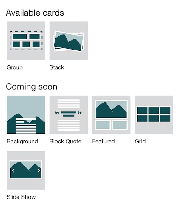
Sway is in preview and the iPhone app indicates that there are more content block (called cards) in the works. Currently you can add Headers (image and text), photos text and More. The more turns out to be ‘cards’ currently groups and stacks of images, more are coming:

sway-comingsoon

Sway on Glow?

When I posted my sway on twitter, I got a reply from someone from Microsoft. I had the chance to ask if Sway would be usable with a edu O365 account:

Sway would make a nice presentation tool for use in Glow.

I’ve got a few negative feelings about all of these services.

Firstly the lack of control of the data you publish to them. I’ve watched a few web services disappear. I generally like to at least have an export option. I’d love one of these tools to give you the opportunity to publish to your own space or download copies. That said it seems unlikely any of these companies are going out of business soon.

I also wonder if all of these highly polished presentation tools take away some creativity. Making anything with technology gives a range of choices about how near the metal you get with your tools. If we were trying to teach learners about presentation there are limitations.

Effortless design

Sway’s built-in design engine takes the hassle out of formatting your various pieces of content by integrating them into a cohesive layout. From there, you can easily adjust the design to create a look and feel that reflects your unique style.

from: Office Sway – Create and share amazing stories, presentations, and more

Some might think that the hassle is part of the fun or learning?

I am quite likely wrong about this. I’ve be saying it for a while. I though the same about iMovie trailers, too easy to learn with. But I’ve seen some nice examples of learning using iMovie trailers.

There is also this problem

Is the Medium the Message?

Both Sway and Slate remind me of medium, I’ve put the same text and images on medium as a comparison.

I also created a home knitted version The Devils Pulpit. This is somewhat less polished, but fun to do.

All three applications are easy to pick up an use. They do not allow much customisation of the layout. Sway having more choices medium the least.

Sway and Slate both offer embed codes, Slate’s is limited to a clickable splash screen that takes you to adobe’s site. Sway’s embed is, in my opinion, much nicer.

For the words and images I was using I prefer Slate’s presentation a little. I like the ‘letterbox’ background images that scroll a lot. I did manage to get these working to some extent (no mobile) on my hand knitted attempt.

Medium is more focused on writing than Sway or Slate.

Medium is the only one that offers something in the way of guidance and suggestions as to what to read. I’ve enjoyed quite a lot of writing on medium through my daily email.

Both Sway and Slate are particularly nice ways to publish when you want your images to be as important as your words. Given Sway has an iPhone app it would be a good choice for using on the move (and on the bus). Sway would be a great tool for producing good looking reports from school trips. For myself I’ll probably stick to blog posts and hand knitted solutions where the fun is in the making.

 _________  ________  _________  ________  ___       ___           ___    ___ 
|\___   ___\\   __  \|\___   ___\\   __  \|\  \     |\  \         |\  \  /  /|
\|___ \  \_\ \  \|\  \|___ \  \_\ \  \|\  \ \  \    \ \  \        \ \  \/  / /
     \ \  \ \ \  \\\  \   \ \  \ \ \   __  \ \  \    \ \  \        \ \    / / 
      \ \  \ \ \  \\\  \   \ \  \ \ \  \ \  \ \  \____\ \  \____    \/  /  /  
       \ \__\ \ \_______\   \ \__\ \ \__\ \__\ \_______\ \_______\__/  / /    
        \|__|  \|_______|    \|__|  \|__|\|__|\|_______|\|_______|\___/ /     
                                                                 \|___|/      
                                                                              
 ________   ___  ___  ________  ___       _______   ________  ________        
|\   ___  \|\  \|\  \|\   ____\|\  \     |\  ___ \ |\   __  \|\   __  \       
\ \  \\ \  \ \  \\\  \ \  \___|\ \  \    \ \   __/|\ \  \|\  \ \  \|\  \      
 \ \  \\ \  \ \  \\\  \ \  \    \ \  \    \ \  \_|/_\ \   __  \ \   _  _\     
  \ \  \\ \  \ \  \\\  \ \  \____\ \  \____\ \  \_|\ \ \  \ \  \ \  \\  \|    
   \ \__\\ \__\ \_______\ \_______\ \_______\ \_______\ \__\ \__\ \__\\ _\    
    \|__| \|__|\|_______|\|_______|\|_______|\|_______|\|__|\|__|\|__|\|__|   
                                                                              
                                                                              
  ________  ___       ___  ___  ________                                      
 |\   ____\|\  \     |\  \|\  \|\   __  \                                     
 \ \  \___|\ \  \    \ \  \\\  \ \  \|\ /_                                    
  \ \  \    \ \  \    \ \  \\\  \ \   __  \                                   
 __\ \  \____\ \  \____\ \  \\\  \ \  \|\  \                                  
|\__\ \_______\ \_______\ \_______\ \_______\                                 
\|__|\|_______|\|_______|\|_______|\|_______|

For the last couple of commutes I’ve been hooked by a ~.

(I am cross posting this at my mainly educational blog and my ds106 one because I think this is so interesting.)

It started when I read I had a couple drinks and woke up with 1,000 nerds which touches on some many interesting things, online identity, ownership, internet history and made me think about about community, teaching about the web and some of the posts Jim Groom has be posting recently (/~space for example).

The ~tilde.club set up by Paul Ford while drinking is

not a social network it is one tiny totally standard unix computer that people respectfully use together in their shared quest to build awesome web pages

It mirrors what was the standard way to give university folk accounts and allows users to work on a remote computer through the terminal, communication and creating web pages. You will get a much better idea by reading the post and going to ~tilde.club and clicking some links.

It looked interesting enough to have a shot, but I had arrived at the party a little late. Fortunately there are other tilde clubs springing up and I got in to totallynuclear.club as ~troutcolor.

All I’ve done so far is created a webpage, set up a blog and visited other members pages. I had a quick chat on the commandline with ~maze who answered some questions.

Hopefully I’ll use the blog to document what I am learning as I go. I am certainly learning. I’ve use a terminal now and then locally on my mac and even very occasionally to play with my Raspberry Pi, but this is quite different. I find myself strangely drawn to the process. For some of the users on the tilde clubs nostalgia is a reason for being their, I missed that whole section of computer history as I started late. Any webpage creation I’ve done has been by uploading files via FTP or by using blogging software or social media. The ~tilde clubs work in both a older and modern modern way. I’ve noticed similarities in the way the developers for glow blogs work, not ftp for them, they talk of git, and are often logged into some cloud server via a terminal.

There are other interesting features emerging on totallynuclear and other tilde clubs I hope to get the courage up to try the IRC chat soon.

What could it be good for

Apart from fun which is a good enough reason.

Given that I an a teacher I wonder if this could be a good way to teach pupils/students about the web. I don’t think that there is anything Perhaps cover some technology history and web literacy. Although the technology is not very shiny and new it does feel quite exciting. It also, to some extent, remove a veil from the technology and perhaps could loosen the ties to silos.

What does it look like?

This is a very short screencast just touching on the basics, which is all I know at the present.

Starters for 10

Some links to interesting totallynuclear things:


Eslabones / Links — [EXPLORE] by Juan R. Martos
Attribution-NonCommercial-NoDerivs License

Recent spotted mostly from google reader:

I am pretty keen on posting photos to the Internet, not because I have great interest (or any skill) in photography but as an alternative, to blogging, way of recording events. I’ve been using flickr since 2004 and am currently enjoying instagram (mine via api) and posterous

Mostly I take photos with my phone (the best camera). Recently I’ve been testing the ways apple gives you to post photos from an iOS device.

Public Photo Stream

I’ve become a fan of photo stream,

When you take photos on an iOS device or import photos from your digital camera to your computer, Photo Stream will automatically upload it so it is available on all your devices.

You can also publish photos to a public photo stream.

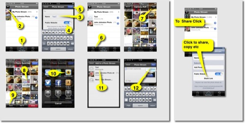
Here is a guide to making a public photo stream. Click to see a bigger version:

How to Photo Stream 500

And here is the photo stream:
Ben Challum – Photo Stream. These are simple and quick to create and easy to share.

iPhoto Journals

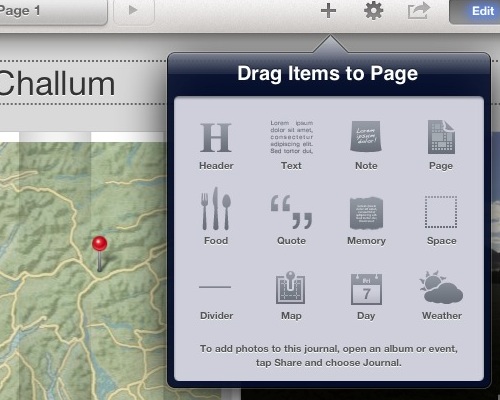
For these you ned to buy iPhoto. There are a wee bit more complex and interesting as you can include a variety of different elements, including, map, weather, notes and the like.

Journal Elements

Again they are pretty straightforward to create and upload. Here are much the same photos as a journal: Ben Challum.

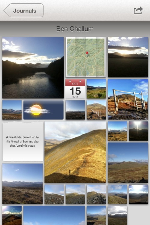
Here is the gallery, created on an iPad viewed in iPhoto on a iPhone

Journal iPhone

Photo Stream vs Journal

On thing I noticed with photo stream was that you could post a link, before the photos are uploaded. With iPhoto journals you have uploaded the whole journal before you can share the link. You can share a photo stream privately, although I don’t think I would. Both produce online sites with pretty horrible urls (eg: https://www.icloud.com/journal/#2;CAEQARoQpdbIWlofBmKRAh_cPbtctA;09537452-2A80-49C7-A86F-71E8734846CF!).

Photo stream is quicker, with less choice, with a journal you can edit the layout of photos easily (especially easy on an iPad). Journals have more features for telling a story by adding non photographic information. The photo stream seem to be designed to share photos as you go.

Educational Use

I could see the photo stream being used by a class or group to share photos and images with each other as they go allowing them to work on or use images created on classmates devices as they are created. It is simple to add images to a shared photo stream over a period.

Shared Photo Streams don’t count against your iCloud storage, and they work over Wi-Fi and cellular networks.

Apple – iCloud – photo stream. Realistically I doubt there are many cellular devices in our classrooms.

Journals are more suit to creating artefacts, perhaps using photos gather via photo stream. Journals allow the addition of text, editing of layout and look like an interesting way to tell a story, record some learning and share it, a fairly easy way to create a image heavy, attractive mini Web site.

Thus far and no further

Apart from the lengthy and un-rememberable urls the other thing I don’t like is the locked in aspect of the sharing. There is on api or RSS feed that could be used take the images and reposition them, but I suppose that is what flickr is for.

Flickr Export from iPhoto

This is pretty good, it is easy from iPhoto on iOS to send images to flickr, create sets and tagging photos as they go, here are the same pictures on Flickr: Ben Challum – a set on Flickr and flickr makes it easy to repurpose the images:


above updated 18 Oct 2022, the object/flash embed code replaced by the url to the set!

Although both photo stream and journals provide slideshow views there is no way, as far as I can see, to show these elsewhere.

Finally

I still like to play with putting photos on a map: A Mapped Walk and a have a reasonable workflow that let me put that together in about 20 minutes. I also like messing with panos so here is one from the same walk:
Ben Challum Pano.