Assignment 8 – This Is The End – #edtechcca8

You must summarise what you have gained or achieved through participating in The Educational Technology Creative Collective. You have a choice of how you do this.

Either

make a visual presentation of what you’ve gained / achieved – use a tool of your choice, a video, Prezi, Animoto, etc

or

make an audio recording of your experiences

I’ve choose the audio option.

See my other posts for edtechcc.

I’ve not got much to add about the course except to reinforce that, if you are interested in ed tech and Colin Maxwell does something like this again I highly recommend it.


Make a custom map using Google Maps.

Use Google Maps to create your own custom map that includes photographs of places.

I’ve been playing with google maps and the google maps api for a while so was please t osee some familiar territory for this Assignment.

This afternoon Dorothy, my wife, and I took a walk round Ardinning Loch, we do this nearly every week often twice a week in the summer, It is a short walk that is always interesting. Ardinning is a SWT reserve.

I used Trails on my phone to record a kml and gps track. The kml file was imported int oa new google map. I uploaded the photos it was then just a matter of dropping on some pins, filling in a title and pasting in the url to the image file.


View Ardinning in a larger map

Another approach

Over the last few year I’ve played with developing a workflow for creating maps like this using the GoogleMaps API. For this I use SuperCard, a mac scripting application. The project allows me to import a gpx file exported from Trails, get exif data for some pictures, iPhone photos have location data imbedded (It also lets me add locations to other pictures by comparing the time taken with the gps file). It then exports a gpx file which I upload to this website and a php file created a map.

Here is the Ardinning Walk map 120303 Ardinning and a whole set of Mapped Walks. In my opinion this has a few advantages over using google maps, you can embed audio & video, and the popup boxes link in sequence. It is also a faster to produce. Obviously it has the disadvantage of being a wee bit trickier to set up.

I’ve a fair number of blog posts going into this in a bit more detail: tagged googlemaps.

But what is it good for?

I think these sort of maps add another dimension to telling a story or presenting information. helping to tell a story in space as well as time. I can see this being incorporated into all sorts of class room projects, either for mapping learning experiences or creating fictional maps. This one The Kidnapped Trail – Google Maps is a great example of the possibilities.

A little bit of DS106

It loks like I can kill two birds here: Google Maps Story — MISSION: DS106

Assignment 3 – Comic Timing – #edtechcca3 « Ed Tech Creative Collective

Make a comic-strip style set of instructions for a practical task. The task you choose is entirely up to you. It could be something that relates to your subject area, or alternatively you can do something more generic like starting up and shutting down a computer, how to set an alarm clock, or how to use the office photocopier.

I’ve always liked making comics both with with pupils and for myself, a few years ago I made this set for my daughter when she went to university: Recipe Comics – a set on Flickr.

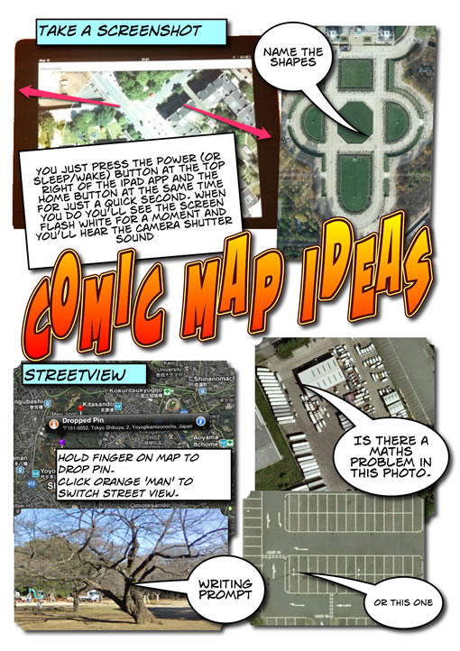
For this assignment I decided to use ComicLife on the iPad, I’ve used ComicLife on the desktop a fair bit but not done much more with the iPad app than quickly demo it. This looked like a good opportunity. I’ve been doing a fair bit of iPad workshopping this week, and one of the things I’ve been showing teachers is some map activities. These are based on ones I’ve carried out a few times with pupils on an iPod touch. Basically taking screenshots of the maps app and using them for Maths or literacy. So the comic was made with the techniques shown by the comic.

Comic map Ideas

Software Thoughts

Although there has been suggested web apps for each of the edtechcc assignments I’ve used desktop applications for the first two (Fireworks, audacity) and now an iPad app. I have used web image and audio editors in the past but never found a compelling reason to use them before a desktop app other than price. I am editing this post in TextMate and will post to my blog via the MetaWeblogAPI rather than by using a browser. The problem with browser applications is with, imo, workflow and integration with other application which is not as mature as desktop or as simple as iOS. ComicLife on a mac is a good example of this, easily showing your images to ad to your comic without having to upload them. Or TextMate, here to add an image to a post I drag the image from the desktop onto the document I am typing in, it uploads it to my blog and inserts the code.

Design Thoughts

I had planned to try planning a bit with pencil and paper for this assignment after watch other folk go through the notes/mind-mapping/sketching process. But again I just got started and played about as I went along. I’ve noticed my ‘planning’, if you call it that, occurs when walking, driving or doing some other activity so I have some idea of what I am hoping for when I sit down. No excuse really and I will try a bit harder on a future assignment.

There was not much thought in this one anyway, I’ve stuck to ComicLife defaults, perhaps over familiar but they do the job I think.

Assignment 2 – The Sight of Sound – #edtechcca2

For this assignment, combine audio effects into a soundscape to represent a place or an event. This assignment may not be suitable for all educational areas, so please feel free to create a soundscape for a scene from a favourite book or a poem, or come up with another idea.

The Real Work – Gary Snyder


All licensed under the Attribution License.

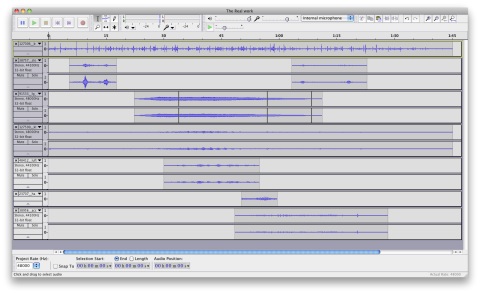
Took me a while to figure out a text. Limited my searching to Freesound to save time. Downloaded a bunch of files and loaded them into audacity. Just sliced, changed the volume, and made some fades. This is a good fun assignment that I’d really like to try in a classroom. Would need plenty of time as I guess this is the best part of 3 hours play for me. A fair bit of this was being distracted on freesound.

The Real Work Audacity

Time Saving Attribution

The only tip I can offer is only tangentially linked to the task and mac only. To gather the links for attribution I open the links in a set of tabs in Safari and then run a wee AppleScript this puts a list of html links to each tab on my clipboard, paste into TextMate and wrap in li tags. (I use FastScripts for running applescripts).

Make two signs or symbols using a graphics tool of your choice. The first sign should be for your own department or course, the second sign should be for another educational department or course. Use only pictures, no words. Use only simple abstracted shapes, no photographs.

Assignment 1 – Signs & Symbols –#edtechcca1

I have made a fair number of web graphics & icons in my time but it has always been pretty haphazard and I’ve never been particularly pleased with the result. I do not think of myself as a particularly visual person.

Earlier in the week I’d read other participants blogs, Helen Morgan, an Art Photo and graphics teacher explained her working method and Colin posted An insight into his creative process as he started the assignment.

I don’t have a department, I work at The ICT & Technical Services Centre in North Lanarkshire, AKA the Computer Centre. By the time I started this Leigh Johnston whose department sounds like it covers the same area had blogged his assignment Assignment 1- #edtechcca1 which gave me some ideas.

Idea 1

Helen and Colin reinforce the idea of brainstorming and prep and both start by sketching (Helen on her iPad) and note taking. I don’t think sketching would help me much and I rarely write with a pen or pencil. I did the same thing as I do with pupils when they do not recognise a word, google images. I find this easier to get children to guess the meaning of a word than a word search. My mental list of words included, North Lanarkshire, Computer, Centre, media, ipad, cloud, network, files, podcast. network reminded me of a the images produced by Webpages as graphs – an HTML DOM Visualizer Applet and I thought of a computer networked to circles in the NLC logo colours, Helen & Leigh’s preliminary ideas reminded me of the NounProject, using that as reference I tried in Fireworks, to draw a laptop sitting inside 3 circles with lines connecting.

In NLC schools we use FirstClass as a email and communication tools so I decided to take the icon for that as inspiration for 3 figures inside the laptop, hopefully indicating community and support. I drew one with simple shapes, then tried to suggest a circle by duplicating and using the distort and skew tools.

Next I though I might use the circles as repenting aspects of the Computer Centre: a cloud, for the network again influenced by the fact I spent yesterday setting up iPads; media, a sort of copy of the media button found in iWorks and iLife mac apps; and files and folders. All were drawn with shapes and lines, the 2 that have multiple objects I added a white glow to separate the layers. After about an hour os so I ended up with this:

Computer Center

Computer Center 64

I was pleased that the gif came in at around the 12k mark but once I made an icon of this(64 pixels square < 4kb), I realised that it is far to complicated to communicate anything and decided to simplify, the quickest way to do this was to get rid of the footery stuff:

Computer Center Simple

Computer Center Simple 128Computer Center Simple 64 Computer Center Simple 64

Afterthoughts: Design

I know nothing about the principles of design, spacing, colour shapes and layout. I know I’ll never manage to read, understand and remember a lot of information on the subject, but I am sure I would be helped by reading a basic short guide. Preferably online and about a page of text.

Afterthoughts: Fireworks

I love Fireworks, I have a copy of Fireworks 8 which I got with a Macromedia Education Bundle a number of years ago. I’ve also got a CS3 version at work. I use it a lot, but in a pretty simple fashion. To do the above I use very few of fireWorks features: Ellipse Tool, Round Rect tool, line tool, align palette, Scale Skew and distort tools. Grid on. I worked in a few documents all 800 x 800 pixels and zoom a lot. I group and drag layers forwards and backwards. That is about it.

Doing the assignment I wanted to be able to do a couple of things I could not do:

  • I used mostly rounded rectangles, I adjusted the corners by hand, then duplicated to get the same corner on another shape, I’d like to know how to numerically adjust the corners?
  • I tried to get the 3 figures looking as if they were part of a circle. I used the skew and distort tools by hand. I assume there is a much better way to do this?
  • I drew the clouds with several circles, to cut off the bottom I grouped and converted to a bitmap then used the select tool. I think there is a better ay of doing this, but do not know it. I want to avoid the convert to bitmap bit.
  • As I mentioned above I used a glow effect to make layers the same colour stand out, I really wanted just to add a outline to a group of objects?

Afterthought: Part 2

Edutalk Fist new

I forgot I should have made a second image. I though I might redo the Radio Edutalk icon. I really like the idea of this, it was originally created for a TeachMeet presentation. It plays on the idea of EDUtalk as guerrilla podcasting. It is a bit rough round the edges, down to my lack of vector skills. So I grabbed a couple of icons from the NounProject to work with.

The first problem was these opened in illustrator, which I cannot drive, after a few minutes I though the learning curve might be a bit much so just copied and pasted from there into Fireworks. A quick select and rotate gave me this icon. I am quite happy with it and it is cleaner round the edges than the old one. I am going to play a bit more, trying to bring a broadcast or RSS element into the picture, but that is for another day.

Microphone by The Noun Project , from The Noun Project collection, Creative Commons – Attribution (CC BY 3.0)
Protest by Edward Boatman, Jay Demory, Tristan Sokol, Shirlee Berman and Doug Hurdelbrink from The Noun Project collection. published under a Public Domain Mark

ED_Tech_Creative_Collective.mp3

This is my attempt at the Preliminary task for the Educational Technology Creative Collective collaboration.

The Educational Technology Creative Collective is

a collaboration of educators investigating and experimenting with digital technologies to enhance education. It is open to anyone (especially educators). The first iteration of #edtechcc will run for 12 weeks starting mid to late January 2012. Enrolment is now open

The ‘course’ was inspired by ds106 which the organiser Colin Maxwell took part in last year. Colin thinks Creativity is a good habit to get into. Make it a habit and creativity becomes easier..

There will be Assignments every week and online meetings every month. There is no requirement to complete all of the assignments. This is my response to Preliminary task #edtechccp1 Tell us something about yourself and what you hope to get from joining #edtechcc.

I have signed up for both this and ds106, I am expecting this course to be a little less strange and intensive than ds106 but not any less valuable. There are already a diverse bunch of folk involved. Much to the learning will be form ones peers on the course. I hope that I can learn to put some polish on my digital artefacts. Over the years I’ve published a lot of this sort of thing but it if fair to say I take a pretty quick & dirty approach to editing and production.