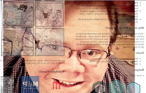
Week two of the teachtheweb mooc starts with a challange: Explore the awesome makes from last week, choose one, and remix it.. At lunch today I though I’d take a very quick stab at this using Chad’s Webmaker Profile, as Chad is a fellow ds106er and I though he would enjoy the play.
The First shot
Given I was on my lunch break, I though I’d just flip the profile: Chad’s Webmaker Profile. I went to Chad’s original profile and added edit after the url, this opened thimble for me to edit his profile. I know that you can flip, turn and rotate elements of a webpage via the css transform. A quick google and I came up with:
transform: rotateY(0.5turn);-webkit-transform:rotateY(180deg);
This rotates content 180 degrees around the y axis. I added it to the css section in thimble, changing this:
body { font-family:Open Sans, "Helvetica Neue", Helvetica, sans-serif;width:1000px;margin:0 auto; }
to this:
body { font-family:Open Sans, "Helvetica Neue", Helvetica, sans-serif;width:1000px;margin:0 auto; transform: rotateY(0.5turn);-webkit-transform:rotateY(180deg);}
I think you need to use both transform: rotateY(0.5turn) and -webkit-transform:rotateY(180deg) to get cross browser support, but I might be wrong.
Quite please with 3 minutes work I posted to the G+ Community.
Looking out
Between a comment and an image I made for ds106 a while back, I started thinking about the page being a view out of the computer, so it should be looking at Chad:Chad’s Webmaker Profile.
On this edit, I’ve added Chad’s photo, hotlinked from his g+ images as a background image. All this took was adding a wee bit nmore css to the body:
background-image:url('fullimageURL.jpg');
	background-repeat:no-repeat;
	background-attachment:fixed;
	background-position:center;
In the bloc above I’ve shortened the url, I used the full url to the image. The code first adds the iamge as a background to the page, ensures it does not repeat, fixes the position to the window and lastly centres it.
Itterating
What is probably irritating for my fellow MOOCers is that I am posting these and as I post geting more ideas, this means a lot of space is taken up on the G+ group.
As I post the last one, I irritate myself as the background picture does not fill the screen. Google again and I get this:
	webkit-background-size: cover;
	-moz-background-size: cover;
	-o-background-size: cover;
	background-size: cover;
All 4 lines do the same thing for different browsers.
I also notice a new post with an audio mashup, this reminds me of Freesound where I find: Freesound.org – “computer-noise_desktop_quadcore_2009.wav” by matucha, I know Freesound supply low quality mp3 and ogg files so add an audio tag to my page, just after the body tag:
<audio autoplay>
	  <source src="http://www.freesound.org/data/previews/160/160465_739478-lq.ogg" type="audio/ogg">
	  <source src="http://www.freesound.org/data/previews/160/160465_739478-lq.mp3" type="audio/mpeg">
	  Your browser does not support the audio tag.
	</audio>
As I don’t have any controls in the tag, the player does not show, but autoplay gets it going when the page loads.
Finally I remember that Chad suggested a gif, so I download his image and make a gif of him rolling his eyes. Upload that to google and hotlink instead of the original jpg as a background. finally I have: Here’s iterating at you, Chad, I had to save twice as I needed to attribute the audio which is share under a Creative Commons — Attribution 3.0 Unported — CC BY 3.0 license.
So here is the Final version:
Here’s iterating at you, Chad.
Musing about Making
So like a lot of the things that I do for fun, this sort of bumbled along with one shot leading to the next. What was great about doing this inside the #teachtheweb community was there were lots of ideas to bounce off. This blog post was started after a comment on the final link I posted. Does that make this connected learning?
One of the lovely things about html is, if you know sometinhg is possible the method is just a quick google away. I wonder if that makes web editing a more accessable way of encouraging creativity?
Thimble thoughts
I’ve made between 6 and 10 experiments with Mozilla Thimble now, which makes me an expert
I’ve found it a wee bit slow on older computers, so I’d think about that before using it in a class.
The split screen view is really good for seeing the changes made to the code take effect. I would however like the option of a tabbed screen so that I could see the whole of the preview without needing a huge screen. I’d also like the forthcoming ability to re-edit a page rather than having to save with a new url. The trail of urls is good for reviewing the process and blogging about it.
I would also like thimble to keep a track of my creations, I am pretty sure I’ve lost track of a few.
The most powerful features of thimble are, for me the templates which have great comments and the way you can easily edit someone else’s creation.


