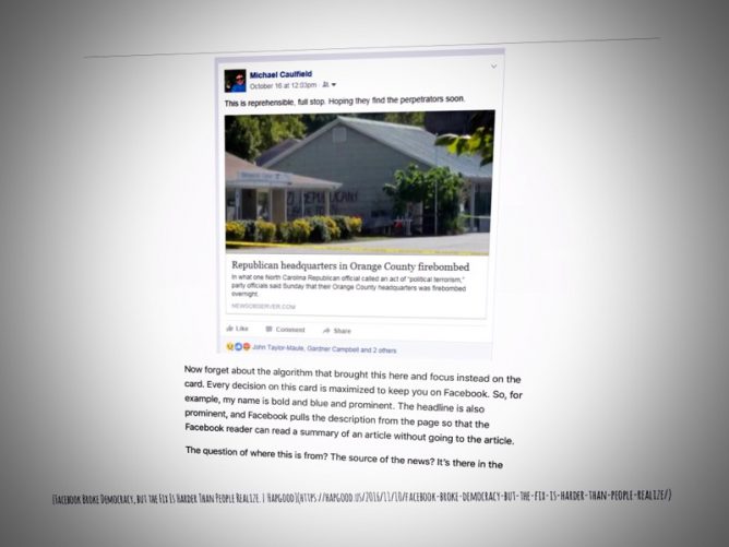
Now forget about the algorithm that brought this here and focus instead on the card. Every decision on this card is maximized to keep you on Facebook. So, for example, my name is bold and blue and prominent. The headline is also prominent, and Facebook pulls the description from the page so that the Facebook reader can read a summary of an article without going to the article.
Facebook Broke Democracy, but the Fix Is Harder Than People Realize. | Hapgood
A really interesting post lots to think about. Unlike Facebook I’d encourage you to read it
I’ve been wondering about what software choices do to us, and our thinking. These sort of considerations are missing from the from the conversation among technology enthusiasts in school education(or I’ve missed them).
I am not sure I am knowledgeable enough to even start teasing this out. Certainly there seems to be more immediate problems in our digital learning bubble (access and skills for two). But if we make choices for ourself and learners with out even considering the effects and affordances of software design we may end up drifting in the wrong direction.
Bonus link: Only Microsoft Could Make Teams
featured image: screenshot shot somewhat messed about with snapseed.


I was listening to Audrey Watters and Kin Lane talk about the challenges of Web 2.0. Watters said that we often say that places like Twitter are easier, but they aren’t. They are quite complex. Instead, we learn to live within their constraints and subsequently change our practices accordingly. Convenience is a dangerous design principle too.