Sway has arrived for Glow users.

Sway allows you to

Create and share interactive reports, presentations, personal stories, and more.

I blogged a bit back in May.

Basically the app helps you present media online in a slick way. I’ve mostly looked at the iOS version. The different versions, Windows, web and iOS so far have different feature sets and a personal Microsoft account allows you do do slightly different things from a business/education account.

The app feels as if it is in pretty active development. Features that were coming soon in May are here.

What is particularly interesting, from my point of view, is that sways can be made public on the web and can be shared ready for remix.

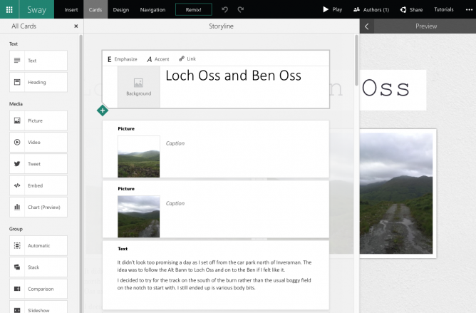
This evening I used the iOS app on an iPad to build another sway (The featured image on this post is a screenshot of the borwser version of the sway, not the iPad view):

It didn’t take very long to add text and images. One difference I noticed was if I was signed into the app with a personal account I could upload video in iOS, I could not do this with my Glow account. Hopefully coming soon.

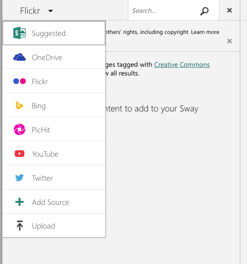
The browser app has a lot more options, including built in searches over flickr, youtube and other media sources.
Screen Shot 2015-10-26 at 21.29.19

It also looks like if you create or even edit a sway in the browser you cannot edit it afterwards on iOS (I might be wrong about this). I do not think either of these things are a great problem, we now know an iPad is a great content creation device and I would hope pupils would be using there camera and their own images for the most part on mobile.

Swaying in Public!

I’ve got the same feeling about the slickness of the creations as I had back in May, mostly about the ‘automatic creativity’ but the most exciting two things about Sway are public sharing and remixing.
Screen Shot 2015-10-26 at 21.19.24

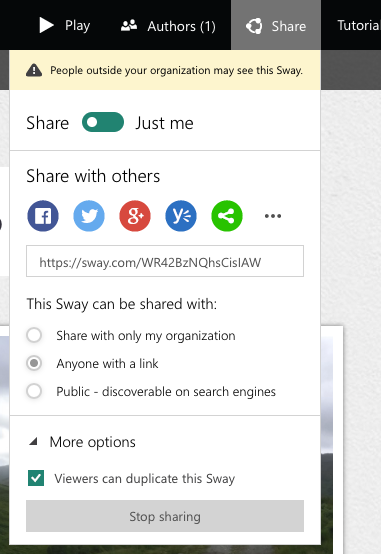
Users have control over who the Sway is shared with and if they will allow their Sway to be duplicated by others.

Learning Opportunities

This is the first of the O365 services to allow public sharing which is very encouraging for those who see value on pupils sharing widely.  I also think that the ability to remix, change and improve someone else’s creation is a important skill.

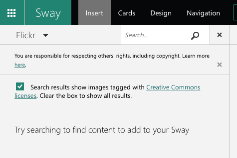
There is obviously the opportunity to discuss aspects of publishing in public, Internet safety and copyright. The copyright issue is also nicely lead into by the browser version:
sway-copyright

We want pupils (and teachers) to understand aspects of copyright and creative commons. Unfortunately the editor does not auto-add attribution but it can be copied and pasted in the browser.

Glow Blogs?

I can embed a sway in this blog using the embed code. Unfortunately this is via a iFrame. iFrames are not supported in Glow Blogs. I do hope we can develop oEmbed like functionality in the Blogs soon in the same way as we have for ClickView video.

It looks like Sway itself supports oEmbed of other content so I’d hope that oEmbed of sways is at least under consideration.

I’ve barely scratched the surface of Sway, and look forward to seeing how it is used in Glow.

Update 11.11.2015 Glow Blogs support the embedding of sways, just paste the url to a sway into the editor: Embedding Media | Glow Blog Help.

Update August 7, 2015, I managed to delete my example sway by accident on my phone! While swiping to delete another sway the interface hung, I swiped twice and lost both! There is no undelete/undo! Another reason for just blogging I guess.

After testing Slate a while back I though I’d try out Microsoft Sway. I downloaded the app to my phone on the bus and made this while traveling home on bus and train.

Sway feels much like Adobe Slate, I used the same words and pictures to test Slate on my iPad a few posts ago: Chalking my First Slate.

Both Apps produce stylish, responsive webpages with nice fonts, full width images and slick galleries created from blocks of content.

Both host everything for you at no cost. Neither lets you download the work locally.

I am ‘reviewing’ them for a position of using them once. Given Sway is beta and I only used the iPhone app I take everything here with a pinch of salt.

While Slate was iPad only ,the iOS version of Sway is for the iPhone. Sway in the browser seems to be more of a web producer fitting in with your MS office account apps.

I’ve also installed Sway on an iPad and it just scales the interface to fit the screen, it seems to work just as well there as on the phone.

I was surprised to find how pleasant Sway was to use on a phone. The interface made it easy to add the content blocks.

The browser version of Sway allows video and access to photos from Flickr, OneDrive, Youtube and more. Slate give access to Lightroom, Creative Cloud and DropBox. The Sway iPhone app only gives access to your camera roll at the moment.

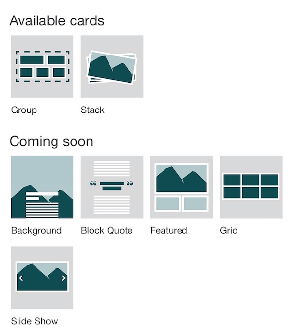
Sway is in preview and the iPhone app indicates that there are more content block (called cards) in the works. Currently you can add Headers (image and text), photos text and More. The more turns out to be ‘cards’ currently groups and stacks of images, more are coming:

sway-comingsoon

Sway on Glow?

When I posted my sway on twitter, I got a reply from someone from Microsoft. I had the chance to ask if Sway would be usable with a edu O365 account:

Sway would make a nice presentation tool for use in Glow.

I’ve got a few negative feelings about all of these services.

Firstly the lack of control of the data you publish to them. I’ve watched a few web services disappear. I generally like to at least have an export option. I’d love one of these tools to give you the opportunity to publish to your own space or download copies. That said it seems unlikely any of these companies are going out of business soon.

I also wonder if all of these highly polished presentation tools take away some creativity. Making anything with technology gives a range of choices about how near the metal you get with your tools. If we were trying to teach learners about presentation there are limitations.

Effortless design

Sway’s built-in design engine takes the hassle out of formatting your various pieces of content by integrating them into a cohesive layout. From there, you can easily adjust the design to create a look and feel that reflects your unique style.

from: Office Sway – Create and share amazing stories, presentations, and more

Some might think that the hassle is part of the fun or learning?

I am quite likely wrong about this. I’ve be saying it for a while. I though the same about iMovie trailers, too easy to learn with. But I’ve seen some nice examples of learning using iMovie trailers.

There is also this problem

Is the Medium the Message?

Both Sway and Slate remind me of medium, I’ve put the same text and images on medium as a comparison.

I also created a home knitted version The Devils Pulpit. This is somewhat less polished, but fun to do.

All three applications are easy to pick up an use. They do not allow much customisation of the layout. Sway having more choices medium the least.

Sway and Slate both offer embed codes, Slate’s is limited to a clickable splash screen that takes you to adobe’s site. Sway’s embed is, in my opinion, much nicer.

For the words and images I was using I prefer Slate’s presentation a little. I like the ‘letterbox’ background images that scroll a lot. I did manage to get these working to some extent (no mobile) on my hand knitted attempt.

Medium is more focused on writing than Sway or Slate.

Medium is the only one that offers something in the way of guidance and suggestions as to what to read. I’ve enjoyed quite a lot of writing on medium through my daily email.

Both Sway and Slate are particularly nice ways to publish when you want your images to be as important as your words. Given Sway has an iPhone app it would be a good choice for using on the move (and on the bus). Sway would be a great tool for producing good looking reports from school trips. For myself I’ll probably stick to blog posts and hand knitted solutions where the fun is in the making.