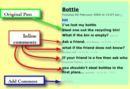
I’ve run a couple of short term collaborative poetry blogs this session. The first was part of the The Sandaig McClure Connection: Solutions – A poetry conversation. I played around a bit with the blog template so that comments became part of the poem. Comments were displayed inline and the link to add a comment became ‘add line’. The comment form was simplified by removing the email and url fields. An entry would look like this (slightly reduced):

At the time I was reasonably pleased with this solution although the whole page layout started to look a bit odd as the poems began varying in length.
Last week we were working on the On the street where you live – An International Poetry Project I kept the blog in a fairly straightforward shape, except for the addition of the (stars) and (wishes) to the emoticons (that works in most of the Sandaig blogs) to help the children assess each other work. The idea with this blog was that the children would use 2 stars and a wish to offer feedback to the children on the other side of the atlantic. (In the event the US students didn’t get to commenting on our work, which might have been due to communication failures between myself and the us organisers).
The problem with using a traditional blog layout became apparent as the number of posts grew very quickly, pushing poem off the front page (which I increased to 30 poems/posts). With hindsight it might have been better to only have the last poem on the blog front-page with a list of all the poems on the side or scattered around. Or maybe no poems just boxes with titles which would open entries in a lighbox/thickbox style when clicked?
With the increase in the number of primary school blogs I’ve noticed a big drop in the comments on on main blog, perhaps due to that blog becoming routine and neglected to some extent. I’ve also not found the time to get the children reading and commenting on other blogs something else I hope to remedy next session.
So I hope to be doing more of these sort of arranged commenting blogs in the future, where there is a fairly intense burst of activity on the blog over a short period. I think this calls for a different sort of organisation and layout, I am just not sure what yet.
Pivot which we use for blogging here is a lot easier for an amateur to mess about with layout and organisation than some of the more popular blogs, its simple template tags allow you to create templates for posts, pages etc with a wee bit of html and css knowledge.
I’ve not seen any other school blogs that have altered the shape of a blog to suit purpose in this way and I’d be interested in any ideas for making these sort of blogs more accessible, interesting and attractive, if you have ideas and examples please let me know.

