Escape from the garden 📷
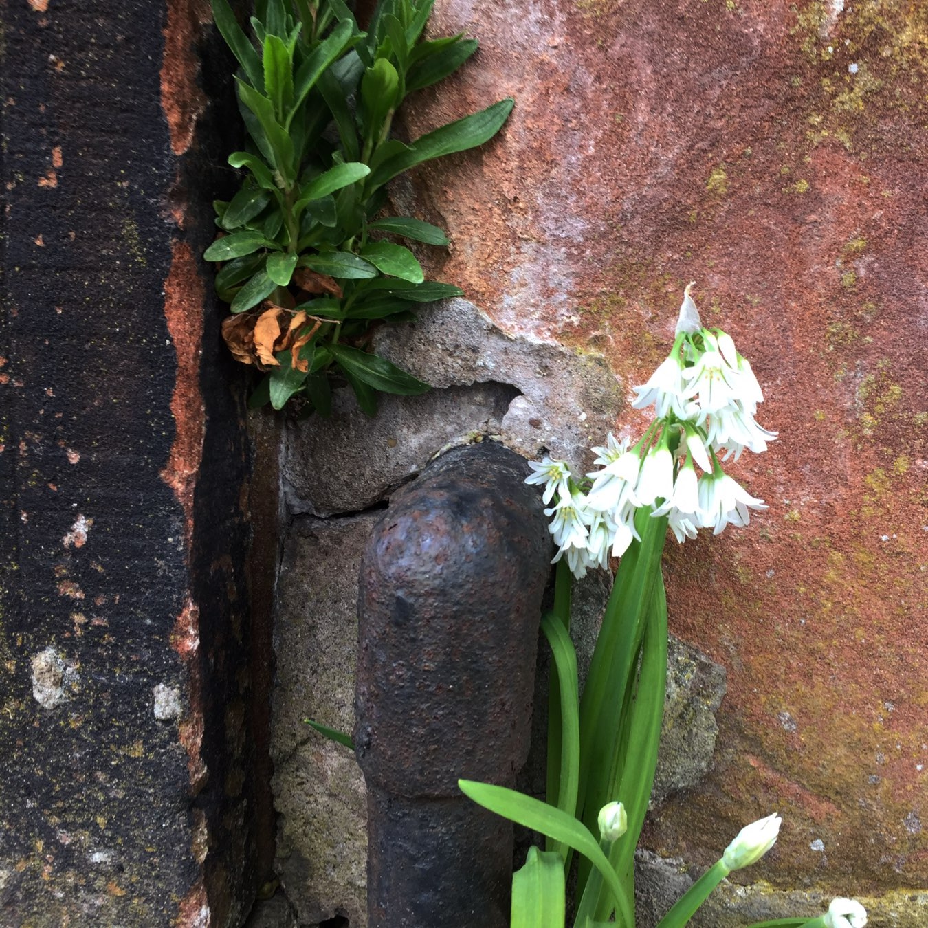
Escape from the garden 📷
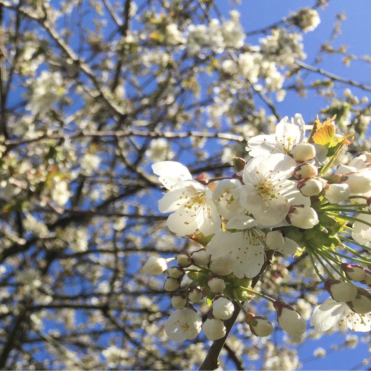
Blossom in Victoria Park this evening. 📷
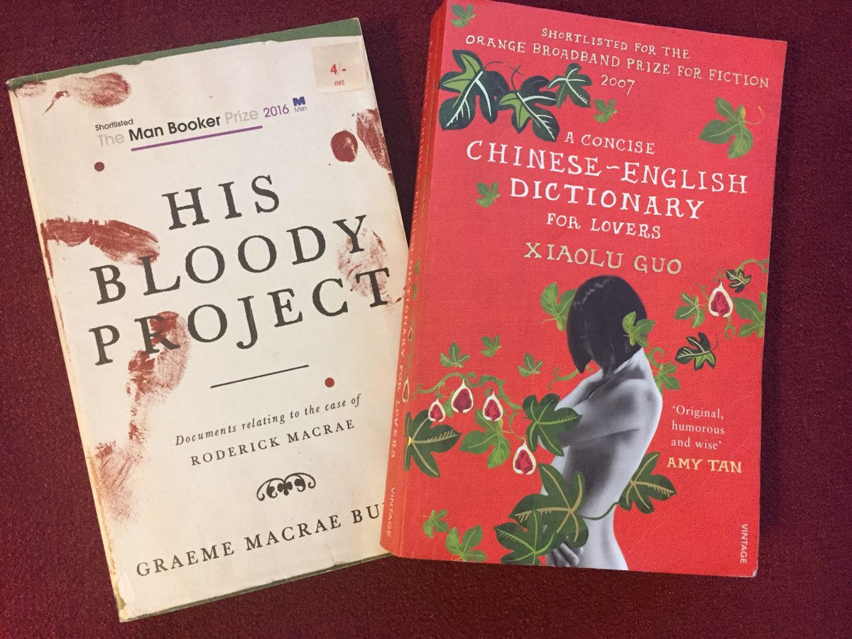
Read A Concise Chinese-English Dictionary for Lovers by Xiaolu Guo with a lot of enjoyment. Hooked by the amusing English of a Chinese learner at the start. The novel develops along with the character’s language. ★★★★ 📚
Having a wee huffduffer spree on the micro.blog podcast discovery page. Nice listing to a bunch of short audios from different voices on my commute home tonight. More lined up for tomorrow.
Blue day on Brassie Beach 📷

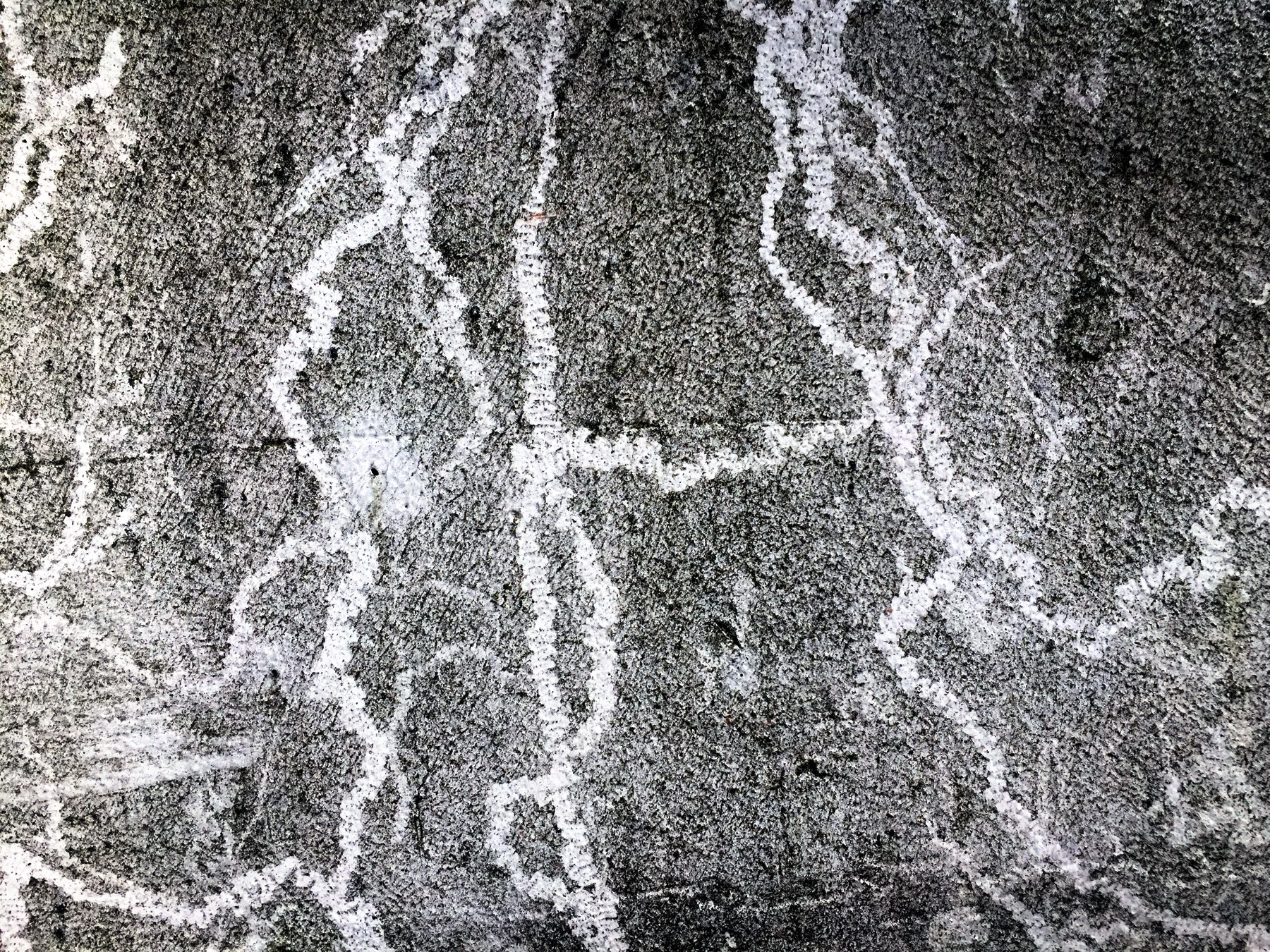
Snail Graffiti, micro.blog outshined filter.
Alan Spence on Scottish Poetry Library Podcast @byleaveswelive. Great listen on the commute. Glasgow Zen always gives me a chuckle.
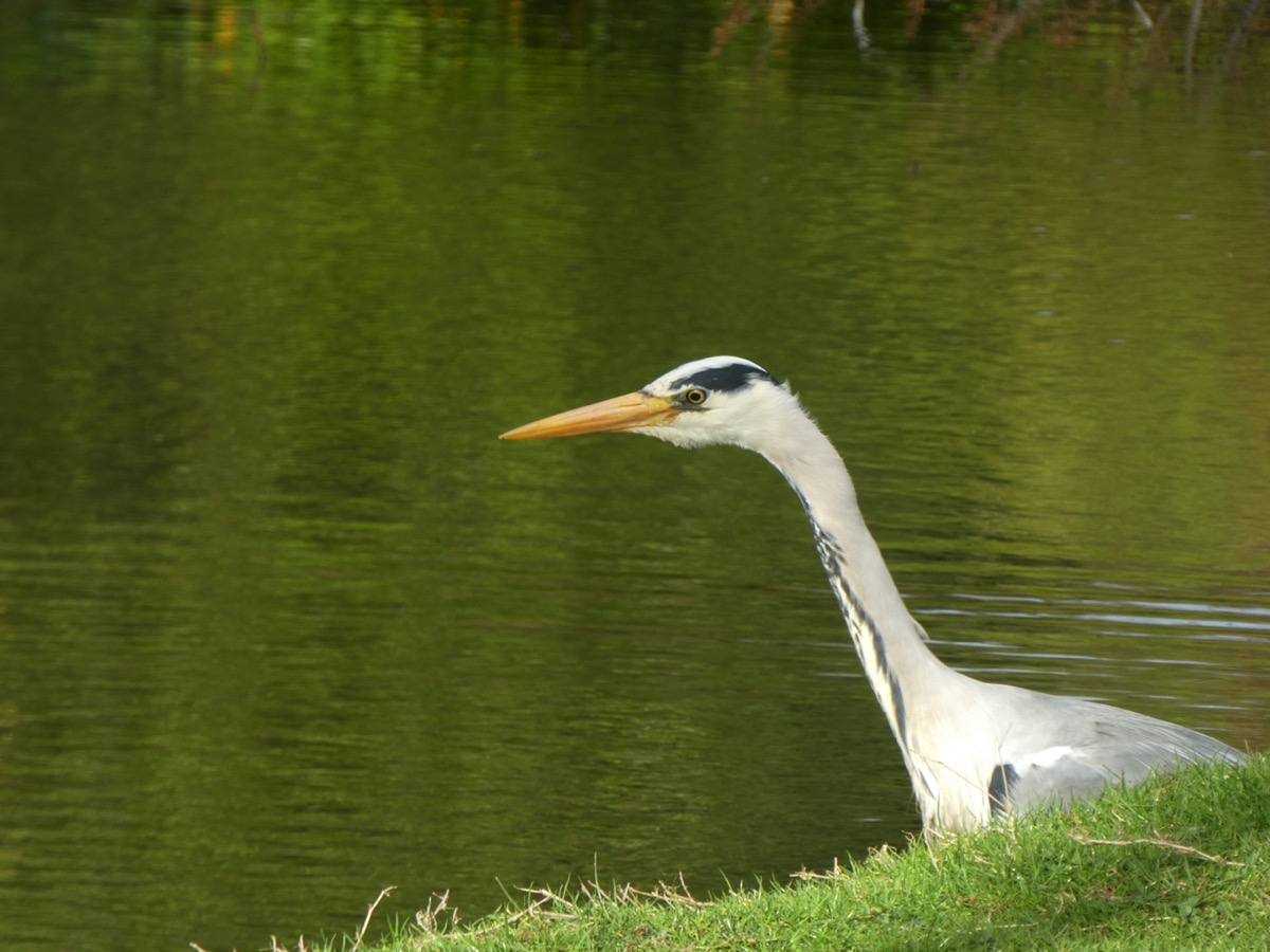
Heron in Victoria Park 📷
Delivery from AbeBooks, or rather shops that sells through AbeBooks. I spent a lot of my younger life in 2nd hand bookshops. Beginning to really enjoy similar online. Prices are great. 📚
@colinwalker thanks for the improvement to the code that compensates for micro.blog not turning on WordPress comments. I’ve updated my functions.php micoblog_functions.php I can now toggle comments on post off.