Glow light came online today yesterday:
Glow Light is a new alternative Glow interface designed with a simpler ‘splash’ page. This ‘splash’ page will display a list of user specific links to allow easier navigation to other areas within the Glow portal.
LTS have a video to show how it works:Glow Light – Making Glow better clicking on the thumbnail above will show a full-sized screenshot.
Lighter
In my opinion this is a great improvement over the ‘Staff’ home page that loads when you log onto glow, much less cluttered and easier on the eye. The branding is subtile and the page has indeed a light feel and it is lighter:
this is the NLC Central Services home page (Staff page) load:

And this is the glow light load:

Showing glow light is just over half the load of the Staff page.
Glow Light also combines the functionality of more than one glow page so it should save quite a lot of time. As a default it comes with 6 ‘navigation’ buttons on the left side 4 ‘settings etc.’ buttons at the bottom and a search box. (see popup image at top.)
Features

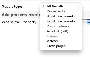
The search is much better than the old glow search. When you get to the results it gets even better linking to an advanced search with allows you to filter by type, and by various properties. The search is pretty fast (on the bases of a few Saturday tests). I never used the old search finding it nearly worthless, this new one looks like it will be valuable.
The six main buttons are as follows:
- News: links to the old Glow Staff home page.
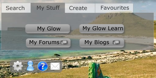
- My Stuff: shows a further four buttons;
- My Glow: opens the my glow page.
- My Glow Learn opens the glow learn page.
- My Forums: opens the forums in a new window.
- My Blogs: opens your list of blogs in a new window.
- Search: shows the search box as it is hidden when ‘My Stuff’ is clicked.
- Favourites: opens your list of glow groups.
- Create: shows buttons to Create Glow Groups and Glow Learn Courses. The Glow Groups button shows, or loads, a list of groups where you can create groups, clicking on the list opens the Create Glow group page for the group selected.
- Timetable: opens your timetable page.
These are frequent tasks inside of glow and in the past would take quite a few click to get to.
You can customise the lists of buttons from the setting and add ‘link’ buttons of your own to the list. I ‘ll probably turn off the Timetable as I don’t have any classes and the Create button as I would normally work down to the site I am creating while I think about it.
There are 4 smaller buttons at the bottom of the main list: Settings, which opens the glow light settings. Profile, Help and Mail which are self explanatory.
My Suggestions
Although glow light is a vast improvement I think it could be made even better. Here is my 2 pence worth:
I like the way the create button loads the groups list on the page and although I don’t think I’ll use it I’d like the favourites button to load my favourites (and just my favourites) in the same way rather than take me to my ‘My Glow Groups’ page.
The other thing that I think could be improved is the buttons. As indicated by the bold & italic text in the description above the buttons have different tasks. Some hide or show elements on the page, some open links and some open links in a new window. I think this is potentially confusing and would prefer something a little more straightforward:

This is pretty quick and dirty but should illustrate the idea: Tabs hide an reveal elements and action buttons show if the link is in a new window or not.
The Future
The future of glow is looking a bit brighter, this is a long overdue facelift and perhaps indicative of the way glow is going. It now is starting to look like hub linking out to different services: glow, blogs (these were updated yesterday too, forums, glow learn and mail. The move to using open source, (phpBB, WordPress) familiar web tools is surely a move in the right direction. I hope too glow will move in the direction of constantly upgrading, or perpetual beta that is popular with open source and web technology (google, flickr) generally. Five years ago I had no idea what sort of web applications I’d be using now and I hope that the next 5 years will bring improvements and completely new ideas. If glow was a portal they services could be easily added when necessary we could have phpMotion ( a youtube clone) or laconi.ca (a twitter one) dropped into glows safe & secure environment at the drop of a hat.
Looking at the Glow futures tender notice:
- Interoperatability of Web Services using Open Standards
- Scalable with capacity to expand the scope to serve a wider population
- Glow Futures will apply open standards aiming to achieve unhindered data flow and interoperability. This model will help Glow to constantly evolve and remain modern.
- The current Glow portal and data centre infrastructure is provided by a single supplier. We envisage that the new service could be procured in a series of lots which may be provided by a single supplier or by a variety of suppliers to allow for a flexible and dynamic approach to respond to evolving requirements.
Gives me a fair bit of hope. I just hope we have, in Scotland, enough money to resource it and the hardware to use it.


Before August 2014 I used disqus for comments, so this form shows up on older posts.
blog comments powered by Disqus