I’ve made a updates to a couple of simple web pages/apps aimed at pupils and teachers using iOS and images.
Photoblitzer
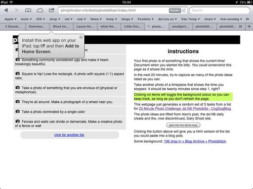
photoblitzer is a really simple page that just gives a list of ideas for taking photos. I originally made it for a #ds106 project (20 Minute Photo Challenge: ds106 Photoblitz – CogDogBlog) and blogged about it on my 106 blog 106 drop in – Photoblitzin.
Since then I’ve used it as a starting activity on a couple of iPad training courses for staff and it worked well.
Originally I was thinking of this as being used on an iphone or ipod touch, but we have seen a lot of schools buying iPads and running a fair number of training twilights on useing these so I updated the app to look a bit better on an iPad:
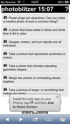
 Staying the same on an iphone or ipod touch:

The idea of the app is to generate a list of ideas for taking photos from a list of over 106 and let people mark them off as they take them. This seems to get people started in thinking about making interesting photos even in the rather limited places we run training courses in. This leads in turn to more interesting possibilities later when working with application to use the photos, say SonicPics, comic makers, iMovie and the like.
FlickrStampr
After I had played with photoblitzer I though I’d do the same sort of thing for FlickrStampr ( a new slightly catchier name for flickrcctouch). I made this way back when I first looked into using iPod Touches in class and neglected it after that.
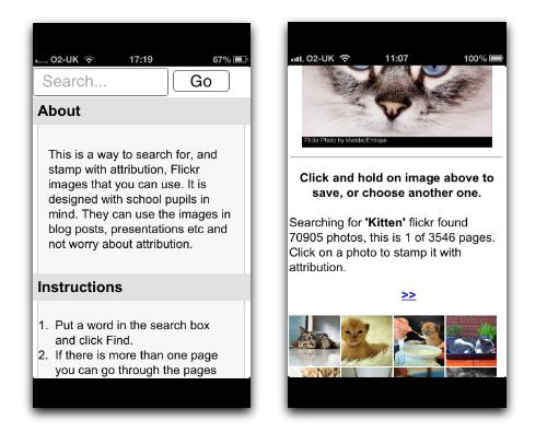
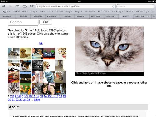
The idea behind FlickrStampr is to give pupils an easy way to use creative commons images with the required attribution. The app lets the user search for flickr photos by tag. and provides a set of thumbnails. Clicking on a thumbnail creates (on the server, a copy of the image with a strip at the bottom with a simple attribution text. The means the user can download the image and use it on blog posts or presentations and the attribution is on the image, easier, I hope, for pupils than copying both the image and the attribution and then useing them together.
I started by cleaning up the iPhone interface a wee bit, before it did a fair amount of hiding and showing, now it just shows everything:  I messed about with the CSS a little and the page looks a bit different on an iPad screen;
  The main problem with the interface as it stands is that if you want to just see a bigger version of the image the image is processed on the server adding the text. This is, I suspect, a little inefficient but it makes for ease of use: you don’t need to preview them click a create button, then download the result. Just press the ‘preview’ and choose save.
Not exactly responsive
The design improvements falls quite short of what is normarly thought of as responsive. In FlickrStampr the layout just squishes as the screen gets smaller, pushing one secion below the other. I photoblitzer I’ve used a media query in the css for the first time: @media screen and (max-width: 480px) there are a lot of possibilities for improvment. I am slowly learning hopefully more improvements to come.
Icons
![]() I’ve now given both an icon to make it look a bit nicer when added as a bookmark on your homescreen, Ive also use a useful bit of javascript that alerts folk to the fact they can do this:Add to home screen, you can see it in action on some of the screenshots above. iOS web apps are a lot less powerful that native apps, especially ones developed by peole like myself with pretty limited knowledge, but they do offer the possibility of simply addressing niche uses. I hope that some folk will find these things of interest or even useful. I’ve had a ton of fun working/playing with this stuff and am open to suggestions for improvments.
I’ve now given both an icon to make it look a bit nicer when added as a bookmark on your homescreen, Ive also use a useful bit of javascript that alerts folk to the fact they can do this:Add to home screen, you can see it in action on some of the screenshots above. iOS web apps are a lot less powerful that native apps, especially ones developed by peole like myself with pretty limited knowledge, but they do offer the possibility of simply addressing niche uses. I hope that some folk will find these things of interest or even useful. I’ve had a ton of fun working/playing with this stuff and am open to suggestions for improvments.
The value of free
As an aside, testing the flickr API, and some recent play with the freesound API reniforce for me the value of sharing under a CC license with the proviSion of a powerful API, there are some amazing people sharing wonderful captures and creations freely, this need to be vslued, used and protected.
