Week Four Review: Design

its_your_funeral-4-icon
I forgot to write up and post this one earlier in the week.

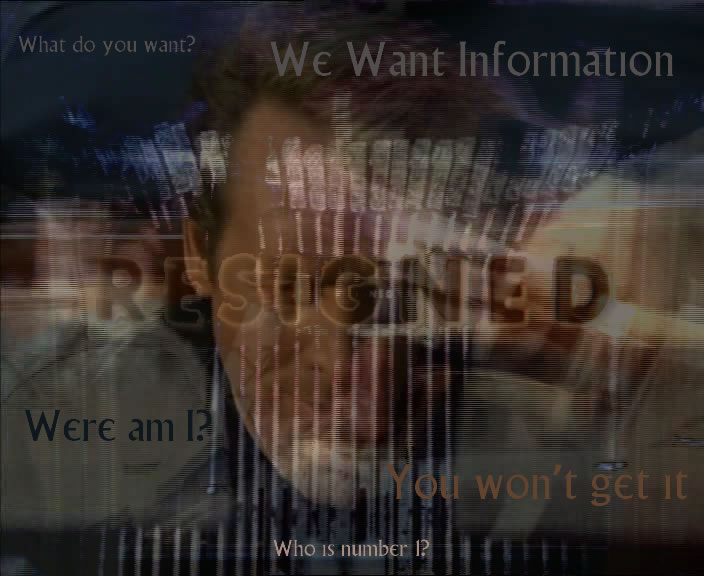
My ideas around escape or rather not attempting to escape seem to be reflected in the surveillance tapes we were directed to watch this week. Number six seems to be more involved in Village Life and made fewer attempts to escape.

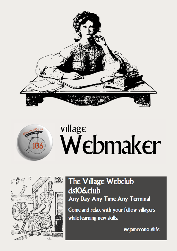
My own week reflected this, I got out a bit more and continued to encourage my fellow villagers to join in the Web Club. Joining the webclub give some extra freedoms that may lead to escape. Andrew picked up on this (Terminal Waypoint).

I spent a fair bit of time in the The Village Web Club, providing some help for fellow inmates, to allow them to decorate their clubhouses (add an image).

I also invite any villager to contribute to A Prisoner 106 Gif Story. I’ll say no more now…

Apart from that I managed a few assignments but hit rock bottom with daily creativity. I also did very poorly with the Design Blitz.

I think this one hits a few of the design blitz targets. I like it anyway:-)

Generally I fell pretty negative about design, I think I can recognise some good design but often fail to implement it or understand it in my own creations. (Kathy cheered me up with a comment on one assignment. )

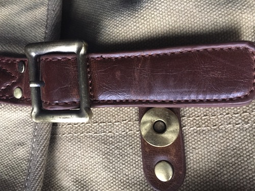
However I did read The Vignelli Canon and found it both enjoyable and useful. It also made me think about where I do exhibit taste in design. I’ve been trying to buy a shoulder bag for a while now. All the reasonably priced ones seem to have magnetic poppers disguised as buckles. This combination makes it almost impossible for me to buy a bag, perhaps I do have a sense of design after all.

pop-buckle
Ugg, the buckle points to security, the pop convenience.

Village Webmaker

A friend pointed me to this assignment, which has never been done before, 2 credits to spend in the shop.

For this design assignment you are tasked to create an attractive advertisement/flyer for some type of event. Be creative. Any event will do, but the point is to entice people to want to attend your event over any other.

from: ds106 Assignments: Festival or Fundraiser?

Village-Webmaker-poster

I am usually wary of design assignments, the few I’ve done are usually full of misgivings. More of that in the weekly report.

I started with the idea of doing a poster for the Village Webclub and along the way renamed it to village Webmaker, in reference to mozilla Webmaker.

I ripped off borrowed Andrew’s lovely badge which gave me my background colour.

I also started thinking about all the efforts to get girls to code and a bit of googling found me some public domain images on wikimedia. I guess that leads to too many things going on for good design but I like all the references and sacrificed design to ideas.

I’ve noticed a few villagers dipping into the club which is interesting and was encouraged (a lot) by Jim’s response. It might not fly this round of ds106 but I think the possibilities of some ds106 web storytelling are interesting.

Mariana had the idea for text based adventure which we could try. I can see a lot of possibilities, most beyond my skills to implement. Here are a couple:

  1. A branching story, someone starts a scene, others that add choices and the results of those choices.
  2. An image map of the village map. Someone puts up the map, folk make a page about a bit of the Village, and the mapmaker adds links to the map. Rochelle reminded me of imagemaps recently. That would be easy.

I’ve also added a page to my club site showing how to add an image to a club page with the terminal.

I’ve also got another assignment to run off quickly.

Resigned: Scene Poster

Capture/Screenshot a scene from an episode of a TV show or a movie and try to make a poster for that episode or movie. Try to make it cool! Be creative! Making it suspense can be a good one!

from: ds106 Assignments: Scene Poster

resigned


Methods:

Export frames from episode with ffmpeg:
ffmpeg -i 'Hammer into Anvil.m4v' -r 1 -f image2 HammerintoAnvil/HammerintoAnvil-%4d.jpg

Nearly 3000 images

Combining images 10 at a time using subtract:

ls *.jpg | xargs -n 10 sh -c 'convert "$0" "$@" -evaluate-sequence subtract sub/"$0" '

Results in 291 images.

Opened one in FireWorks, takes frames of prisoners photo being typed over, from these frames:

Added a layer using the resigned card. Deleted the background from that layer leaving the text.

Text Later, interpolated, with a stroke filter.

Added the second last frame again to emphasise the face a little.

Added text picking the colour from elsewhere on the image.

Export to jpg.

I am quite interesting in the effect of combining and layering images automatically. Some hint at psychological layers that are darker than the colours used in the series.

Takes quite a lot of HD space up, but I think there are few more stories to be extracted. Especially later in this episode where number 2 and 6 are trying to get inside each other’s heads.


Trading Paradis

Again I’ve not been keeping up with ds106, over the last couple of weeks the only thing I’ve managed to do is collaborate on the radio story. I’ve not even been reading other folks posts I am afraid. I did notice Giffi.us a Collaborative Story that is an offshoot of ds106 with folk taking some gifs for a walk and creating a story. Today I joined in with a quick gif from Les enfants du paradis.

As I had some time in my hands, I went back to design week and had a quick troll through the assignment bank, finding Movie Trading Cards

Design trading cards for your favorite movie. Grab a screenshot from a film of your choice to create a trading card in the spirit of the classic Star Wars movie trading cards.

astonishing-beauty

And an animated gif one:
master-of-mime

So I guess more than one assignment, but I am not counting stars.
Les enfants du paradis is a wonderful movie, I’ve not watched for a few years, I’ll have to make time for that soon.

Falling short

After last week’s excitement, I have fallen a little short of my own expectations this week. I’ve not been near minecraft, didn’t even get started on the Design Safari. I manage one Design Assignment, the creative commons one and then tried the Lyric Typography Poster.. I saw a couple of great results (and this looks like something professional) for this and though it didn’t look too hard. I cranked through iTunes until I remembered one of my favourite song Judge Not, there are a few different reggae songs with this title but the one I like is by Dennis Brown:

The phrase I like is Judge Not, for we all fall short of the glory of Jah. I’ve taken Jah out of the quote as I am not religious. I like the idea of trying and falling short more than Judge not lest you be judged (Matt. 7:1).

I started thinking about this, googling King James font, I saw a reference to calson, so decided to go with Big Calson which seems to be on my mac. I was hoping to get a sort of old looking text and spent a couple of hours failing to get anything like my imagination. I did consider the old english type of font. I was also thinking for some reason about flags and decided on a flag background; red gold and green seemed obvious. Many tutorials and tests later I ended up with this:


This falls very short of the target: Choose one of your favorite lines from a song and illustrate it using only typography. Consider how the font, color, sizes and placement of the typography can reflect or emphasize the meaning of the words.

Nevertheless I have now spent a deal of time playing with photoshop and trying out various tutorials, hopefully this will help.
Here are a few of the tutorials I read through:

So I had another go:
I do not think I have much natural design sense. I have enjoyed and learned from other ds10ers design assignments this week.

My week 4 flickr daily creates:

Please specify a Flickr ID for this gallery


And a soundcloud one: