Lazy Art on the Couch

I did manage a couple of daily creates this week but my hold on the ds106 stream is pretty tenuous. Given the public commitment to Art on the Couch last week both here an on The DS106 Good Spell I clicked the random button a few time this morning until I got my first visual image. This is it:
Daily Create 2 – Susan V. Laws

Again I can’t see any license on the image so you will have to head over to the link to see it.

1. What stands out the most when you first see it?
The Rotated S

2. Explain the reason you notice the thing you mention in number 1.
It is quite an organic line, it immediately reminded me of a river on a map.

3. As you keep looking, what else seems important?
The background colour and grid.

4. Why does the thing you mention in number 3 seem important.
This reinforces the idea of a map for me. Although the scale would be off it it was a map unless the river was very broad.

5. How has contrast been used?
The nature of the assignment, creation of a cattle brand leads to a very strong contrast indeed. There is also a contrast between the curves of the s and the straight lines of the L. The L becomes imposed on the S perhaps.

6. What leads your eye around from place to place?
The lines. There is not much else to follow. The longer I look at it the more I feel the tension between the straight and the curves.

7. What tells you about the style used by this artist?
The lines are very strong the occasional kinks are surprising.

8. What seems to be hiding in this composition and why?
When I first saw the image I was immediately reminded of something, but could not quite put my finger on it. I search on google for similar images unsurprisingly brought up mostly typographical ones.

image-search

This then brought to mind occult symbols:

Clavicula_Salomonis_BL_Oriental_14759_35a

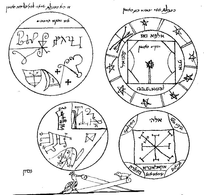
a group of pentacles from the Hebrew manuscript (BL Oriental 14759, fol. 35a) By Anonymous – [1], Public Domain,

And the language of hobos and tramps:

hobo-signs

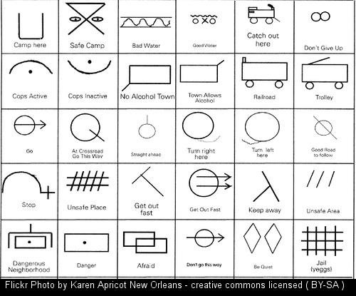
Hobo signs Karen Apricot CC BY

Both of these types of image are secret languages, they give hints of something behind, just out of touch. Is this a map of a secret language.

9. Imagine the feelings and meanings this artwork represents?

A brand has quite negative connotations. Here a painful reminder of ownership. In other contexts a marketing tool. Here the L seems to cut across and stamp the more natural S.
In a western context we are aware of the history of the west, a series of impositions on the natural environment. We have the idea of the ‘original’ Native Americans working with the land as ‘part of the natural landscape’. This was followed by ranching which was then fenced in by farmers.
I know this is a pretty sketchy overview gleaned from various poorly remembered western movies I watched as a child, the short story Shane that was one of my favourites aged 10 and Bury My Heart at Wounded Knee a few years later.

10. What other titles could you give this artwork?
Cutting Across, Imposition or Squaring the river, Yin and Yang go West.

11. What other things interest you about this artwork?
I am guessing that this was made on a phone. I didn’t do this daily create, but assumed that most folk would use fonts. I am presuming that this was made on a phone, with an app that straightens drawings out a bit.
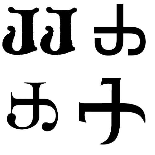
Late Create

I was planning to do this one, but didn’t get round to it, mine would have been the double-J. Perhaps like this:

double-j

Thanks to Susan for providing me with an hour or two’s musings. And to Mariana for gathering and suggesting the questions.

My Way To The West

Last week on the first #DS106 GoodSpell of the year Mariana and I talked about her DS106 Art on the couch idea. Simply this is a way of looking at someone else work in DS106 and thinking about it in a bit more depth.

Critique is often most instructive for the person offering it. In looking at other people’s work, and formulating your opinion of it, you’re learning a great deal.

I’ve given this a go before but as mentioned on the show, neither Mariana or I had done as much as we hoped. I said I was going to try and use the technique in playing with Western106.

I’ve managed to reach Saturday without participating in western106 at all this week. Real life intervened:( I decided to at least give this a shot. I headed over to the ds106 and typed /random after the url. This will lead to a random post, try it: http://ds106.us/random. And because DS106 syndicated posts it will lead, more often than not, away to a participants blog.

I had decided to go with the first visual post (movie, image, gif ect) that I hit and arrived at: Assignment Heaven – The Good, the Bad and the Kelly 3 roll of the dice. The post mentions 2 assignments, the first was to take a picture and change the hues to make it look different. which fits the visual bill. (You can head over to the blog or butterfly! onFlickr to see the image as it is All rights reserved.)

I hope Kelly takes this extended look at her work in the spirit intended. She might find this useful or not. The intention is for me to think and learn a wee bit.

1. What stands out the most when you first see it?
The lurid pink that edges the clouds.

2. Explain the reason you notice the thing you mention in number 1.
I’ve been playing with glitching photos on and off for a while, this is the sort of effect that could alomost have come out if you glitched an image. Eye catching and unnatural that emphasises somethings in the original and deemphasises others.

3. As you keep looking, what else seems important?
The angle that the picture has been taken at. The ‘butterfly’ and its slightly wonky antenna. The wings of the butterfly. The effect of the wrought iron is agmented by the colours coming through from the sky.

4. Why does the thing you mention in number 3 seem important.
I am not sure if the orientation of the photo was carefully selected or if it was rotated 90 degrees by accident. This adds to the overall ‘glitchness’ of the image. and adds to the idea that it might be accidental.

5. How has contrast been used?
There is a very strong contrast between the wrought iron in the foreground and the sky beyond. This is perhaps stronger in the original as the change of hue effected the almost black foreground as well as the back.

6. What leads your eye around from place to place?
The butterfly’s antenna, one leading onwards into the sky the other off to the right of the image.

7. What tells you about the style used by this artist?
There is an offbeat quirkiness about the image. There is something optimistic going on.

8. What seems to be hiding in this composition and why?
The bigger picture, we do not see the whole gate, where it is ect.

9. Imagine the feelings and meanings this artwork represents?
Curiosity, looking into the unknown, heading west.

10. What other titles could you give this artwork?
New Horizons

11. What other things interest you about this artwork?

I wonder why the blogger choose a All rights reserved license on flickr. Early days in #DS106, or a deliberate choice?

I would like to see a third version with the flattened very high contrast foreground of the original over the adjusted sky.


I enjoyed that, the structure from the questions helps me stick with an image for a lot longer than I usually would. I hope to keep up this practise for the rest of the Western106 course.

Greenhorn Mistake

Cowboy01
I’ve had a bit of difficulty getting time to watch any westerns. I decided to have a listen instead. I headed over to the Old Time Radio on Internet Archive and had a dig around, I spotted Gunsmoke – Single Episodes where there are 473 files.

I have heard of the show but knew nothing of it so I added the first episode to an RSS feed I am subscribe to in overcast and listen to it on my phone on the way to work.

As I listened I was quite surprised, this sounded familiar, sort of a bit noir 106. The hero showed a fair amount of cynicism, there were a couple of very negatively portrayed characters and most of the townsfolk were mob minded.

The hero was quick on the draw but noble in a Chandlerish way. He had a much worse temper than Marlow.

After listening I had to check Wikipedia

In the late 1940s, CBS chairman William S. Paley, a fan of the Philip Marlowe radio serial, asked his programming chief, Hubell Robinson, to develop a hardboiled Western series, a show about a “Philip Marlowe of the Old West”.

from: Gunsmoke – Wikipedia, the free encyclopedia.

So much for my insight. The whole Wikipedia article is quite interesting. I’ll probably listen to a few more on my commute.

The gif is from the trailer of Cowboy (Delmer Daves, 1958)

One of the more unorthodox westerns of the 1950s, Cowboy is also one of the best.

Seems like the stereotype of cowboy movies is a bit more complex than I though.

Giffing the open range

Yesterday I read a great post on open which included this point:

Focusing on simple cost-benefit analysis models neglects the creative, fun and serendipitous aspects of openness and, ultimately, this is what keeps us learning.

The Cost of Freedom – The Open World | Open World

and noticed in Lorna’s twitter stream:

Which took me to: New York Public Library Invites a Deep Digital Dive – The New York Times

And on to:
Public Domain Collections: Free to Share & Reuse | The New York Public Library

where I searched:
Search results – “cowboy” – NYPL Digital Collections

And followed:

Cowboys on the range–an autumn beef roundup, Montana, U.S.A. – NYPL Digital Collections

Which linked to:

Step 2 CREATE : Stereogranimator

And so:

Using Freesound.org – “The Only Harmonica in The West” by IrishCinema and my Gifmovie plugin which Mariana’s post: Riding to Western 106 country reminded me of.

A little Fun and Serendipity on a rainy afternoon.

Wandering Links

Today’s daily create: #tdc1457 Do Some Research on Spaghetti Westerns | The (new) Daily Create

wandering-fw

I followed a wandering trail picking up some links on the way:

To be continued…