A friend pointed me to this assignment, which has never been done before, 2 credits to spend in the shop.
For this design assignment you are tasked to create an attractive advertisement/flyer for some type of event. Be creative. Any event will do, but the point is to entice people to want to attend your event over any other.
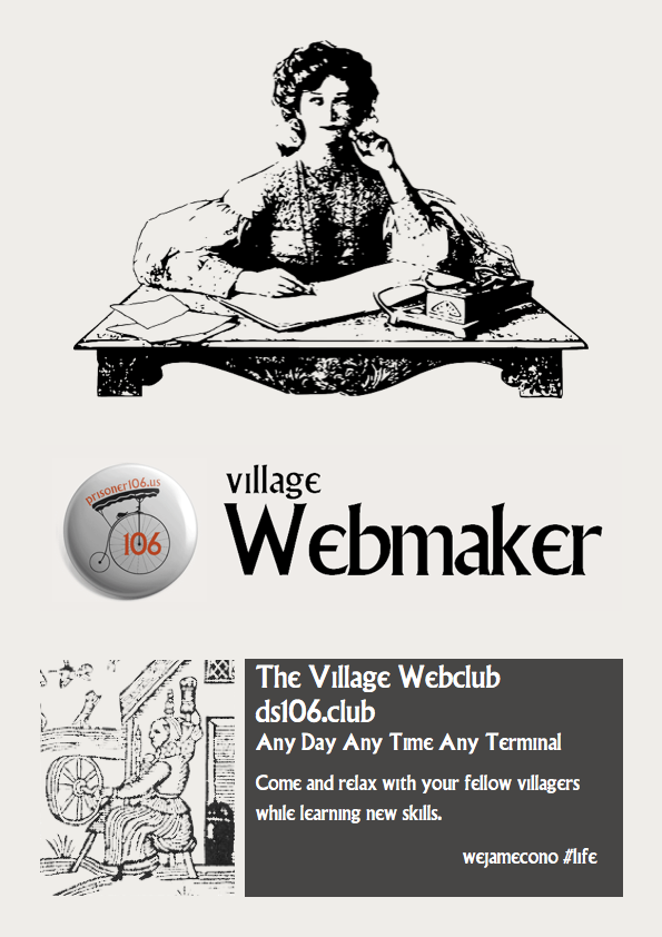
from: ds106 Assignments: Festival or Fundraiser?
I am usually wary of design assignments, the few I’ve done are usually full of misgivings. More of that in the weekly report.
I started with the idea of doing a poster for the Village Webclub and along the way renamed it to village Webmaker, in reference to mozilla Webmaker.
I ripped off borrowed Andrew’s lovely badge which gave me my background colour.
I also started thinking about all the efforts to get girls to code and a bit of googling found me some public domain images on wikimedia. I guess that leads to too many things going on for good design but I like all the references and sacrificed design to ideas.
I’ve noticed a few villagers dipping into the club which is interesting and was encouraged (a lot) by Jim’s response. It might not fly this round of ds106 but I think the possibilities of some ds106 web storytelling are interesting.
Mariana had the idea for text based adventure which we could try. I can see a lot of possibilities, most beyond my skills to implement. Here are a couple:
- A branching story, someone starts a scene, others that add choices and the results of those choices.
- An image map of the village map. Someone puts up the map, folk make a page about a bit of the Village, and the mapmaker adds links to the map. Rochelle reminded me of imagemaps recently. That would be easy.
I’ve also added a page to my club site showing how to add an image to a club page with the terminal.
I’ve also got another assignment to run off quickly.
Well Mr. Johnston – don’t be so hard on yourself! Seems that your goal to round out and stretch is working. Just as your sharing examples push many of us in new directions – seems your hanging around and seeing others work in different areas is rubbing off and catapulting you in leaps. 🙂
The use of thirds and choice of text and graphics is very effective. The black and white ink graphics with the Village font and the idea of a webmaker are very effective. The use of a female brings it today as well. The little color and more modern graphic of the penny bike keeps it current so one can tell it is meant to be today – but yet in a past context.
The change to webmaker too conjurs up the idea of guilds and master craftsman as the Village sets a time gone by and the graphics.
I think this is great and more deeply actually addresses that while new technologies make things easier, there are many things to learn from what was before and how without the early ways there would not be the new.
You said alot and in great design!
Hi Kathy,
Thanks, delightful comment. Some things in there that must have been unconscious on my part!