But is Gif Art?

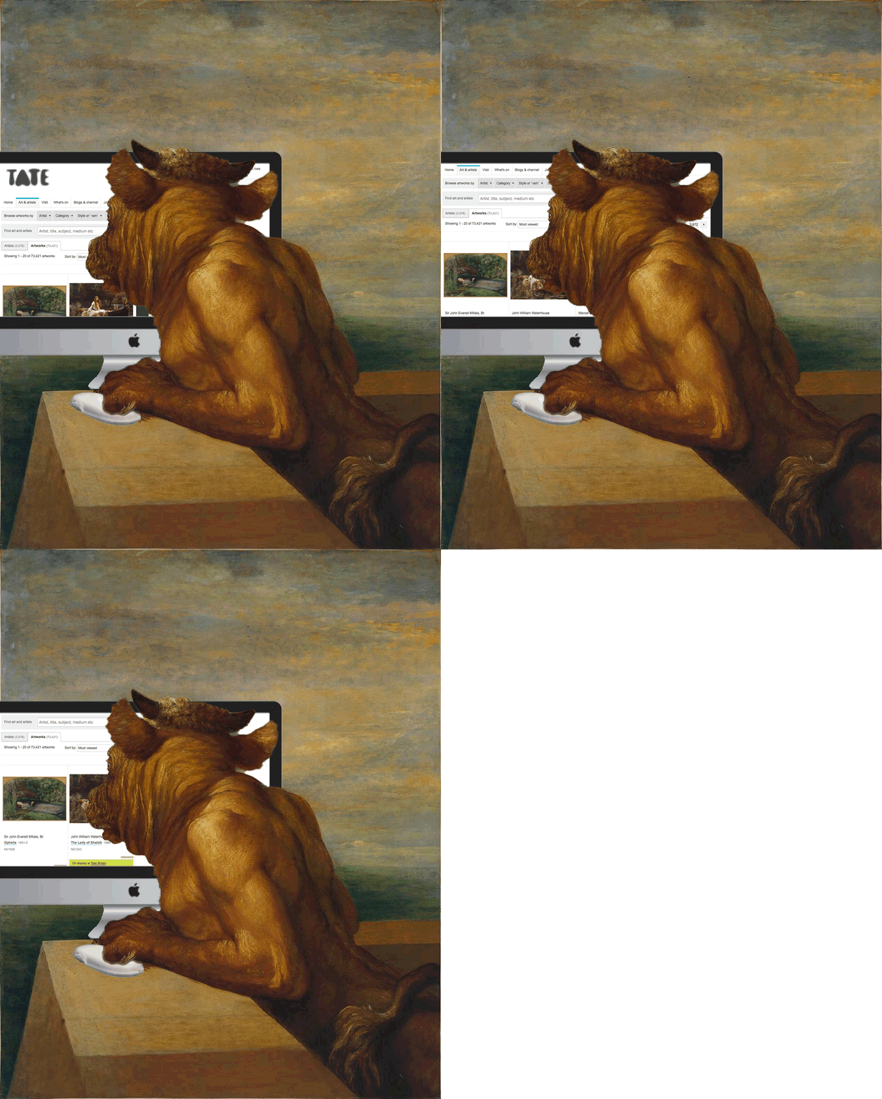
watts-the-minotaur

I’ve come across a couple of interesting projects this week involving animated gifs.
1840s GIF party: call for submissions | Tate and
The GIF the Portrait Project.

So far I’ve giffed a few images from the the Take 1840 exhibition. I then to find animating gifs as an end in itself, it is interesting that the both these projects seem to be thinking them as art.(there are some amazing examples at Tate Collectives tumblr).

I’ve also been reading The Academic GIF where Jim Groom is talking about how to:

integrate animated GIFs into a curriculum centred around film analysis.

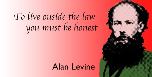
The Tate challenge has become a ds106 Assignment, which already has some submissions, Tom Woodward producing beautifully subtle and a much more dramatic version of the same painting. Alan Levine puts both subtlety and humour in the same gif.

GIF FIGHT!! has a Special 1840 Edition which is filling up.

For the tate gifs I’ve changed tactics a little. I’ve been using photoshop to split the images into layers before switching to Fireworks for animation. Photoshop has superior selection tools.

I an unsure if anything I’ve done is Art but it is interesting in lots of different ways, from visual puns and jokes through problem solving. I wonder if gifs could become part of an arts curriculum in schools?

Can We live Outside Google?

It is only those who do nothing who makes no mistake.

― Pyotr Kropotkin, Anarchism: A Collection of Revolutionary Writings

This daily create started out with the memory of the common Anarchy graffiti, with the A is a circle.


Anarchy by Jonas B

I presume that I must have had the definition in the back of my mind.

I thought I’d plant a giant A over the Wikipedia screenshot.
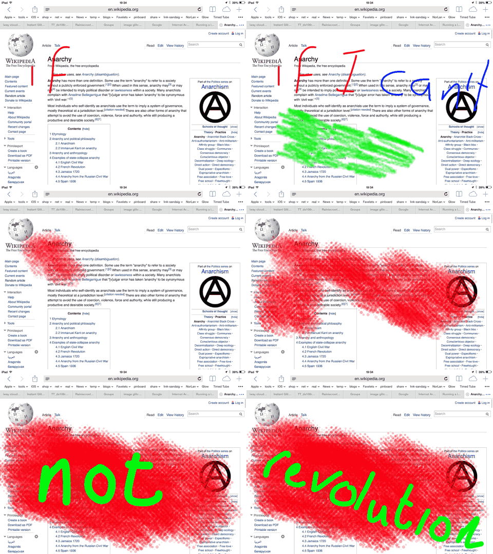
On my iPad I took a screenshot and opened in in brushes. At that point I though it might be nicer to use a relevant quotation and of course though of:

If I can’t dance it is not my revolution.

I decoded to do it as a gif and started writing exporting to my photo library as I went.

When I got to ‘dance’ I changed it to gif.
I imported these images into 5seconds, which I find the best ios gif app and made a gif.
Unfortunately the speed slider did not work this time (too many frames?) to I needed to export to Dropbox and open on a mac in fireworks.
Once in fireworks I set the frame rate and did a very quick edit on the colour of gif.
if-i-cant-gif

I decided not to post the image to flickr as I really do not like putting gifs there. Given this was throwaway I just posted it to Google+
I’ve been really enjoying the ease of using google plus for ds106 as well as being dissatisfied with it’s locked in nature. I had even been musing about blogging about it and thinking about possible systems that could replace it. Given the amount of conversation in g+ in this round of ds106 compared to blog comments it is pretty obvious that a lot of folk love it.

And my gif got comments, and I got called out:
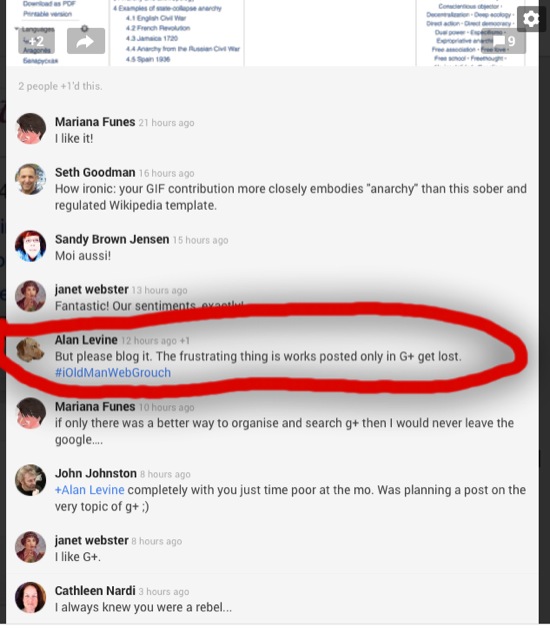
g+comments

Quite rightly so. Hopefully the short notes above are enough to cover the daily create. Google plus is another matter.

 Google Plus’ minuses

When I first joined g+ I did not like the experience. To much, to confusing. It was only when I started using it for community activity, first with etmooc, then Mozilla webmakers and now the headless round of ds106 I begin to see how it could be used. The way it can pul different sources together quickly and easily and the simplicity of adding comments makes it an addictive experience.
The first flaw appeared quite quickly, in etmooc I was happily clicking plus one to keep a track of posts I was interested in. In a browser to eg a link to the post you need to pop a menu, choose link to post and then copy the link that shows up. You then need to click ‘done’. Not quick. There is no feed or api for getting information out of G+.
Earlier in the round of ds106 I complained about this, I tried to avoid commenting in google for a week and following the blog flow, but after a while I found that it was the easiest place to follow the action. I still don’t like the fact comments on my posts don’t stick with the post, I am afraid I like comments, conversations and ideas from others. So I end up in g plus, living for the moment, losing my history.

I think one of the reasons that g plus has worked so well for the headless ds106 is that we have a pretty small class size. I do not think it would work so well if more people were posting, but I could be wrong.

The differences between g+ and twitter include a couple of things that are relevant here, the #ds106 tweets are lost in my timeline, I follow too many folk to see much of what passes. I could just run a search or keep one alive in tweet deck but I don’t use tweet deck any more. The other difference is that twitter, despite killing the RSS feeds does have an api, this means something could be built on top of it or it could have been built in.

I really hate the way g+ is designed to keep you locked in, to have such useful facility and not have any easy way to share on another system might be good business for google but it grates against my idea of a fee, open and loosely joined web. Unfortunately for me the people involved in ds106, their activities and generosity keep pulling me back.

What would be great would be something that functioned like g+ but was open and sharable with RSS/APIs etc. If it both posted comments to and displayed comments from the original sources. Of course this would be a can of worms. Some blogs have comment feeds that would work out ok. Then there is youtube, where my comments now seem to be linked to google plus, more problematic, flickr and twitter would need different methods.

A start along these lines might be something like my DS106 Activity Dashboard (very much the beginning of an idea)

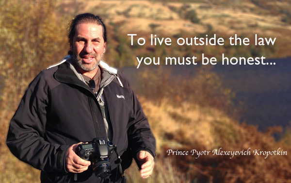
After all this thinking I need a couple of quick triple trolls to clear my head:
alan-kropotkin

Young_Kropotkin

Grin and Bear it

bearteeth

A new DS106 assignment ds106 Assignments: Illustrating Odd Autocompletes by Tom Woodward.

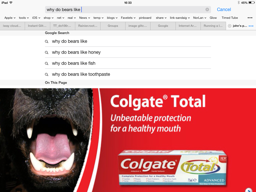
Google Autocomplete is an oracle with strange powers to bring oddities into your life. This assignment asks you to seek out that randomness. Start with a strong phrase (things like “I hate . . .” or “I love . . . ” seem to work well.) and run through the alphabet looking for really odd autocompletes. When you find a good one, screen capture it and create an illustration that represents the search string

looked like a quick win for a lazy Sunday.

I found a nice CC bear on Flickr (Shipshewana, Indiana | Flickr – Photo Sharing! Creative Commons — Attribution 2.0 Generic — CC BY 2.0) and am afraid I don’t care to much about the copyright of the Colgate ad, parody perhaps.

Merged the bear and add using Superimpose on the ipad and added that to the google screenshot using PS touch.

Superimpose is a great application I posted a screencast of using it on my other blog a while back.

The google auto complete looks like rich pickings for strange serendipity.

Who Loves Ya, Cory?

cory-kojak
So I am looking at Headless Weeks 13 & 14: ximeR and M@$#up, there is a lot of stuff to watch, read and think about. There is also Alan’s Triple Dog Dare for one is:

Remix a photo of Cory Doctorow

Which I’ve done before.

So I end up on my usual ds106 pattern, browsing through the assignment bank until I circle back to the first one (Cory). By this time I’ve forgotten some of the details, but I am busy dreaming and googling.
I start with Yul Brynner, and veer to Kojak. I’ve now forgotten all of the details and heading for a Troll Quotes. The idea in my head is a wonder, perfect photocopying, I’ve forgotten I don’t know photoshop and a searching flickr for a background.

Lower Manhattan Skyline, New York, NY, USA
Lower Manhattan Skyline, New York, NY, USA | Flickr – Photo Sharing! by Flickr: MD111’s Photostream
used under a Creative Commons — Attribution-NonCommercial 2.0 Generic — CC BY-NC 2.0 license.

My imagined assignment is now better than perfect. Then it is all cloud filters, saturation for the brown ‘kojak feel’, a bit of a mask on Cory to try and get a drawn feel.
By bedtime I am delighted, in the morning I realise I am probably missing the target on a few levels, driving to work I decide to post anyway, maybe I could get a story out of the making?

The quote: Quote by Yul Brynner: We are born alone, we live alone, we die alone….

BrigaDS106

So at the start of this week I though I’d get back into the headless course and do some video assignments. I spent a while looking through them but this one looked like it would be fun:

Download different scene clips from one movie to create a short commercial for DS106. Clip, trim and remix them to let people know what DS106 is all about and how they can find us at ds106.us. Challenge yourself to overdub the audio to have the characters saying DS106 where it would be appropriate.  Also try and add the DS106 logo onto an object in a scene. You can find an example at The DS106 Matrix

from: ds106 Assignments: Mash A Movie For DS106

Looking back at the description I see I’d completely forgot about the logo bit, I also didn’t dub the characters. Rochelle’s example is great and I started looking for some sort of SF connection, but somehow ended up in Brigadoon. Perhaps because cogdog visited Scotland last weekend.

Also because I only read the assignment once I got it into my head to make a trailer. I found the Brigadoon trailer on youtube:

Mt first idea was to find the clips used in the trailer without the text and recreate it shot by shot with new text and voice over, of course I could not find the same scenes on youtube. I did find a few clips and decided to go with the timing and titles from the trailer with different scenes behind.

I expected to do the editing in iMovie but quickly realised that its titling was not up to the zooms and swings on the original. I switched to Screenflow as I knew it could do nice transitions of text. There I found that the text could be animated nicely but not curved. So I opened up Fireworks to make transparent titles which I could animate in Screenflow.

By now I’d spent a fair bit of time on this with nothing to show so I only spent a few minutes realising that recreating the text accurately would take more time than I had. I just found a vaguely similar font and used that. I also used a brighter yellow that the original.

brig-title-04

The workflow was, copy a frame from QuickTime of the original trailer, paste into Fireworks. Add text, messing a little with the spacing. Then aligned the text to a path if I needed a curve, dropped a shadow, grouped and gave a quick blur. Hid the scheenshot layer and exported as a transparent png. I hide all the layers, added the next screenshot a did the next bit of text. All the graphics from one document for laziness.

Back in screenflow I edited the clips, animated the overlay and added a voice over. Screenflow is a pretty nice tool for this sort of thing and would be good and doing the animated typography sort of movie too.

This took a fair amount of time, if I had ben willing to spend more time it would have been less rough, the text could have been better, the voice over I just used the first take with my macs inbuilt mic as I did that bit at lunchtime in work. I had to extract audio from different bits of video and move it around, again I did a fairly quick and dirty job of this, trying to balance time and fun. THis is the final effort:

You might notice that some of the characters are aligned weirdly or rotated a bit, this was first due to accident, I could have cleaned up the path they were aligned to in Fireworks but left them in and made some more for extra klunky charm;-)