Along the Daily Trail

I’ve not been keeping up with #western106 much other than a couple of artonthecouch posts.

But I have done the odd Daily Create. I am noting them here as some sort of record before they are lost in twitter.

The 4th February:

Create an Oregon Trail Game Screen for DS106

ds106-nyan

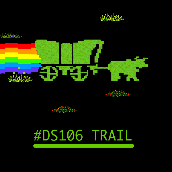
A quick google for the Oregon Trail found a pile of bitmap art. Seemed like a nyan cat riff might be appropriate. Downloaded the gif, opened in fireworks and chopped away.

5th February:  Create some stop motion using Vine

I’ve not got a vine account so just make a 6 second stop motion video. Snapped some photos with my iPhone (sitting on a lego mount), stitched together with the 5secondApp and exported as a video. I had to speed it up a bit to get 6 seconds, here is a 17 second version.


7th February  Add to the Code of the Cowpoke

A one line response:

8th February  5 Years Since Dr Oblivion Disappeared: Craft an Western…

coyboyoblivion

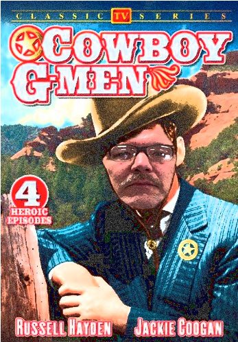
The idea of Cowboy G-Men is a a wee bit mind boggling. This is a really badly edited file. Quick & dirty. I did run a quick fliter over the cover to try and match the Doctor’s face, but didn’t spend enough time on it to do a good job.

11th February  Treasure of the Hills

We were to draw a map. Remembering the ‘lights out for the territories’ above I remembered that the map is not the territory. So my tweet went:  this mondrian is not the territory

mondrian-map

Which lead to a nice bit of twitter banter.

and so on…

12th February  Extra Terrestrial Visitors from the Far Frontier?

nyan-cow

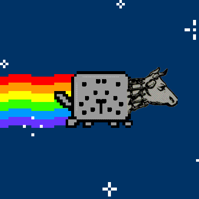
Was a no brainer, back to FireWorks for a quick edit. The cow head was found on Flickr with a no known copyright restrictions filter.
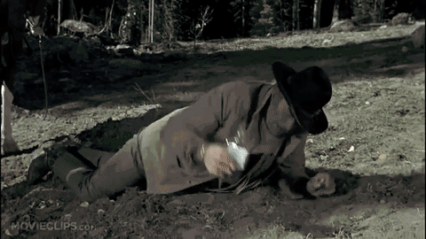
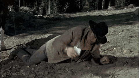
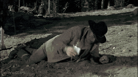
Yesterday:  Caption Remington

an-unbranded-cow

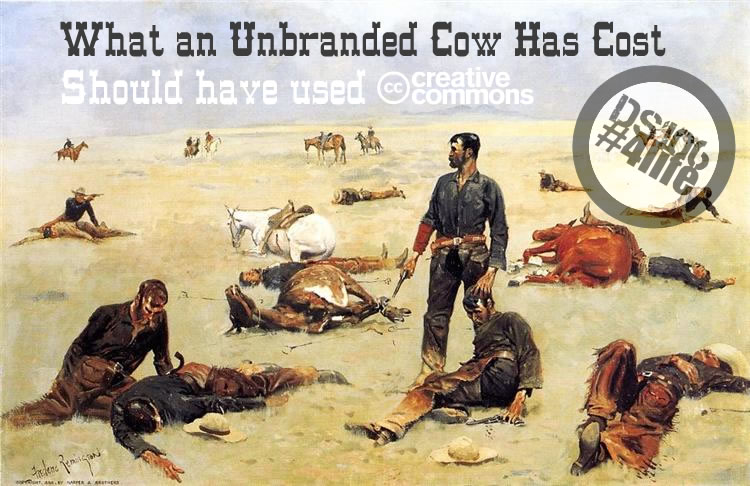
I was trying to hint to other folk that they should license their DS106 content to make it review and remix friendly.

The stream for the daily create has been pretty active and it is great to see all of the different responses. I am not sure I’ll get to doing much more on #western106 but I am certainly enjoying the odd 15 minutes on the daily create. Thanks to Alan (and Mariana) for the continual work on organising the fun.


Drunken Gifs

One should always be drunk. That’s all that matters…But with what? With wine, with poetry, or with virtue, as you chose. But get drunk.

― Charles Baudelaire

I find gifs intoxicating, not the looking at them but creating. This is ridiculous. I find sitting down to rip a gif out of a movie and crush it to as small as possible, or to script some sort of weird concoction a lot of fun.

This morning I read Alan’s post: Ooh Ooh Mr Kotter! I Know How To Optimize My GIFs!. It is great, a reminder than some of the fun of giffing is keeping the file size down.

Alan uses photoshop. I’ve never really got a grip of that application. I tend to use firefox, gifsicle or even javascript.

I though that I would se if I could replicate the sort of optimisation he writes about using gifsicle, for a wee bit of fun and learning. I’ve blogged about gifsicle a fair bit here. Gifsicle is a commandline application for working with gifs. It can be downloaded from Gifsicle: Command-Line Animated GIFs.

I stared by a sort of replication Alan’s use of GIPHY’s GIF Maker. I took:

and fed it through the giffy tool.

Like Alan I ended up with a huge gif 4.5MB worth.

So I downloaded it and got some info about it with gifsicle on the commandline:

john$ gifsicle -I drunk.gif
* drunk.gif 45 images
  logical screen 480x270
  global color table [256]
  background 2
  loop forever
  + image #0 480x270 transparent 2
    disposal asis delay 0.07s
  + image #1 480x270 transparent 2
    disposal asis delay 0.06s
  + image #2 480x270 transparent 2
    disposal asis delay 0.07s
  + image #3 480x270 transparent 2
    disposal asis delay 0.07s
  + image #4 480x270 transparent 2
    disposal asis delay 0.06s
  + image #5 480x270 transparent 2

There were a good few more lines, but I got the idea that there were 45 frames, each about 0.07 seconds long.

The plan was to reduce the colours, the number of frames and increase the length of frames to compensate.

The first thing I tried was:
gifsicle -U -O3 -d 28 --colors 128 drunk.gif `seq -f "#%g" 0 4 45` -o drunk-128.gif

What this does

-U: unoptimises the input gif

-O3: optimises the output

-d 28: set the delay to 28/100 sec

  • colors 128: cuts down the number of colours

seq -f "#%g" 0 4 45 is a clever bit:-) it produces a sequence of numbers with # in front between 0 & 45 in jumps of four. This causes gifsicle to use those frames of the original gif. We have reduced the number of frames and increased their length to keep the animation the same length.

This resulted in a 1.1MB file, not too good. I repeated the exercise with 64 colors, which got the gif down to 800kb

drunk-64

Not too bad but still a bit big. I then remembered there was a version of gifsicle that could do lossy production of gifs. Alan mentions using this in photoshop. I had downloaded this before but lot it. A qick google found this interesting post: Lossy Optimization for Animated GIFs – Rigor and lead to Lossy GIF compressor where I downloaded the modified version again.

I could now:

gifsicle -O3 --lossy=80 -U -d 28 --colors 128 drunk.gif `seq -f "#%g" 0 4 45` -o drunk-lossy-128.gif

Which give me, a 480k gif:
drunk-lossy-128

gifsicle -O3 --lossy=80 -U -d 28 --colors 64 drunk.gif `seq -f "#%g" 0 4 45` -o drunk-lossy-64.gif reduces the colours and weighs in at 391k (from the original 4.5MB).

drunk-lossy-64

I decided to push the lossyness a bit to:
gifsicle -O3 --lossy=160 -U -d 28 --colors 64 drunk.gif `seq -f "#%g" 0 4 45` -o drunk-lossy-160-colors-64.gif

drunk-lossy-160-colors-64

This only shave the gif down to 325K so I think lossy=80 seems a good compromise.

This sort of gif fun might not be everyones drink, but if you are interested, I’ve some more scattered around this blog including: Taking Command of Gifs – 106 drop in and Gifsicle Comparison

Lazy Art on the Couch

I did manage a couple of daily creates this week but my hold on the ds106 stream is pretty tenuous. Given the public commitment to Art on the Couch last week both here an on The DS106 Good Spell I clicked the random button a few time this morning until I got my first visual image. This is it:
Daily Create 2 – Susan V. Laws

Again I can’t see any license on the image so you will have to head over to the link to see it.

1. What stands out the most when you first see it?
The Rotated S

2. Explain the reason you notice the thing you mention in number 1.
It is quite an organic line, it immediately reminded me of a river on a map.

3. As you keep looking, what else seems important?
The background colour and grid.

4. Why does the thing you mention in number 3 seem important.
This reinforces the idea of a map for me. Although the scale would be off it it was a map unless the river was very broad.

5. How has contrast been used?
The nature of the assignment, creation of a cattle brand leads to a very strong contrast indeed. There is also a contrast between the curves of the s and the straight lines of the L. The L becomes imposed on the S perhaps.

6. What leads your eye around from place to place?
The lines. There is not much else to follow. The longer I look at it the more I feel the tension between the straight and the curves.

7. What tells you about the style used by this artist?
The lines are very strong the occasional kinks are surprising.

8. What seems to be hiding in this composition and why?
When I first saw the image I was immediately reminded of something, but could not quite put my finger on it. I search on google for similar images unsurprisingly brought up mostly typographical ones.

image-search

This then brought to mind occult symbols:

Clavicula_Salomonis_BL_Oriental_14759_35a

a group of pentacles from the Hebrew manuscript (BL Oriental 14759, fol. 35a) By Anonymous – [1], Public Domain,

And the language of hobos and tramps:

hobo-signs

Hobo signs Karen Apricot CC BY

Both of these types of image are secret languages, they give hints of something behind, just out of touch. Is this a map of a secret language.

9. Imagine the feelings and meanings this artwork represents?

A brand has quite negative connotations. Here a painful reminder of ownership. In other contexts a marketing tool. Here the L seems to cut across and stamp the more natural S.
In a western context we are aware of the history of the west, a series of impositions on the natural environment. We have the idea of the ‘original’ Native Americans working with the land as ‘part of the natural landscape’. This was followed by ranching which was then fenced in by farmers.
I know this is a pretty sketchy overview gleaned from various poorly remembered western movies I watched as a child, the short story Shane that was one of my favourites aged 10 and Bury My Heart at Wounded Knee a few years later.

10. What other titles could you give this artwork?
Cutting Across, Imposition or Squaring the river, Yin and Yang go West.

11. What other things interest you about this artwork?
I am guessing that this was made on a phone. I didn’t do this daily create, but assumed that most folk would use fonts. I am presuming that this was made on a phone, with an app that straightens drawings out a bit.

Late Create

I was planning to do this one, but didn’t get round to it, mine would have been the double-J. Perhaps like this:

double-j

Thanks to Susan for providing me with an hour or two’s musings. And to Mariana for gathering and suggesting the questions.