After last week’s excitement, I have fallen a little short of my own expectations this week. I’ve not been near minecraft, didn’t even get started on the Design Safari. I manage one Design Assignment, the creative commons one and then tried the Lyric Typography Poster.. I saw a couple of great results (and this looks like something professional) for this and though it didn’t look too hard. I cranked through iTunes until I remembered one of my favourite song Judge Not, there are a few different reggae songs with this title but the one I like is by Dennis Brown:
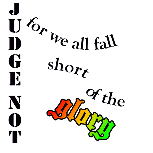
The phrase I like is Judge Not, for we all fall short of the glory of Jah. I’ve taken Jah out of the quote as I am not religious. I like the idea of trying and falling short more than Judge not lest you be judged (Matt. 7:1).
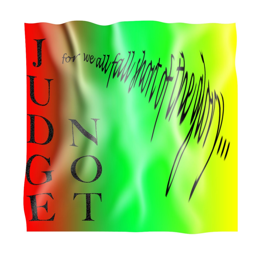
I started thinking about this, googling King James font, I saw a reference to calson, so decided to go with Big Calson which seems to be on my mac. I was hoping to get a sort of old looking text and spent a couple of hours failing to get anything like my imagination. I did consider the old english type of font. I was also thinking for some reason about flags and decided on a flag background; red gold and green seemed obvious. Many tutorials and tests later I ended up with this:

This falls very short of the target: Choose one of your favorite lines from a song and illustrate it using only typography. Consider how the font, color, sizes and placement of the typography can reflect or emphasize the meaning of the words.
Nevertheless I have now spent a deal of time playing with photoshop and trying out various tutorials, hopefully this will help.
Here are a few of the tutorials I read through:
- Smoke Type in Photoshop in 10 Steps | Abduzeedo | Graphic Design Inspiration and Photoshop Tutorials
- 50 Stunning Photoshop Text Effect Tutorials | Smashing Magazine
- BioRUST.com :: Tutorials >> Grunge Rubber Stamp
- Make a 3D Looking Flag Tutorial by Hesido
My week 4 flickr daily creates:
Please specify a Flickr ID for this gallery
And a soundcloud one:

There is no falling short in DS106 — just getting back up and trying again.
As for design sense, I strongly believe that it can be learned to a large degree. We may not all be able to become professional designers, but we can learn how to tune our sense of design so that we’re better at imagining the possibilities. I also strongly believe that a lot of what frustrates people is when their (current) expertise falls short of their vision. That’s not a lack of design sense, just a need to continue to hone skills. Which you’ve certainly got a strong start on!
I know how frustrating it is when you’ve got this amazing vision in your head of how the product is going to turn out, but then you get into Photoshop and simply can’t execute it fully.
Oh! And when you get a chance, can you change your permalink settings on your blog (Settings -> Permalinks) from the default to “pretty” permalinks? For some reason, WordPress isn’t generating the feed for comments on posts correctly when default permalinks are being used. As a result, on the ds106 site, our comment counts are off for your posts.
Hi Martha,
Thanks.
I guess I was not clear. I like the idea of falling short of ‘the glory’. In the. Song there is I believe an implicate forgiveness. I also like the idea of failing, failing early and often.
I am with you on the learning. I’ve been finding my fellow participants more use than many design web pages: shorter and easier to digest.
.htacess updated and links are prettier.