@cogdog lovely stuffI didn't recognise/recall word but got a phenakistiscope here. I think @jimgroom has one too pic.twitter.com/40UQfNr6Ms
— john johnston (@johnjohnston) June 25, 2016
The linked site: phenakistiscope de bal | Succursale | Ruppert & Mulot is indeed lovely. It uses Flash. This got me thinking a wee bit about CSS animations.
CSS phenakistiscope was a first test, followed by More phenakistoscope.
Here is an example (click on the image to see it without animation):
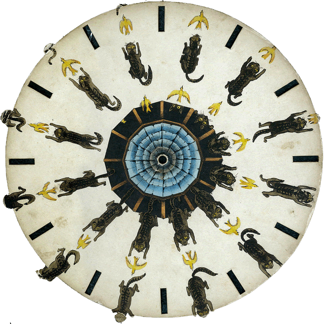
Image from: NCSSM | Flickr – Photo Sharing! used under a Creative Commons — Attribution-NonCommercial-ShareAlike 2.0 Generic — CC BY-NC-SA 2.0
There are more examples on the pages linked above, but I’ve added the following css to this blog (using the jetpack css module).
.catchase {
    animation-duration: 2s;
    animation-timing-function: steps(13,end);
    animation-name: anticlockwise;
    animation-iteration-count: infinite;
}

@keyframes anticlockwise {
    to {
        -ms-transform: rotate(0deg);
        -moz-transform: rotate(0deg);
        -webkit-transform: rotate(0deg);
        -o-transform: rotate(0deg);
        transform: rotate(0deg);
    }

    from {
        -ms-transform: rotate(360deg);
        -moz-transform: rotate(360deg);
        -webkit-transform: rotate(360deg);
        -o-transform: rotate(360deg);
        transform: rotate(360deg);
    }
}
CSS3 Animations have some advantages over gifs, for this sort of thing, smaller files & more colours for two.
The css contains an animation @keyframes rule containing the animation code (the anticlockwise bit above) which is referred to in the images style. The bloc above could be shortened to:
animation: anticlockwise 2s steps(11,end) infinite;
I’ve played with css animation here before: Not an animated gif and am now beginning to get a handle on it. Wondering if it could be useful for optical illusions. I’d also like to make a virtual Phenakistoscope that could load different files that need different speeds and steps. Adding some sort of mask/viewer would be nice too…